
A few cards that noticed something about your running
You don't have to open Stats to find out this month is going better than last month. If it is, a card says so, and it goes away on its own when that stops being true.
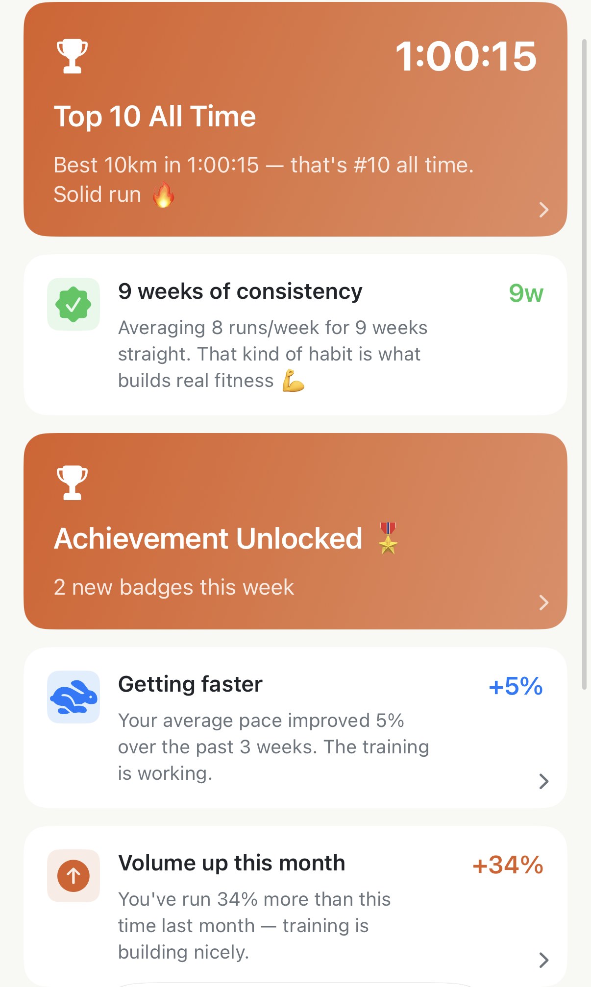
The Insights tab opens on a row of chips and then a feed. The feed isn’t your runs; it’s a handful of cards, never more than eight, each one a thing the app noticed in the last couple of months. A personal best. Three weeks in a row of showing up. A pace that’s quietly picked up. It looks like a social feed and reads like a friend who keeps your logbook.
Nothing on it is typed in. Every card is worked out from the runs already in Apple Health, so a runner opening the app for the first time with a year of history gets a feed, not a blank page.
What’s above the feed#
The chip row: Stats, Trends, Categories, Records. Those are doors to whole screens and each has its own page here. This page is about what sits underneath them.
The cards you’ll see#
The feed sorts by what matters most and what’s freshest, so a record from this week sits above everything.
New Personal Best! is the big orange one. A run in the last month landed at the top of one of your ten boards: fastest 5K, longest run, most climbing, any of them. If it landed at tenth instead of first, the card says Top 10 All Time, which is still worth a card. Tap it and you’re on that board.
Achievement Unlocked is the same shape, in the badge’s colour. A badge earned in the past week; several in one week fold into a single card that counts them. Tap it for the gallery.
N weeks of consistency counts finished weeks with three or more runs, back from last week, and appears once you’ve strung three together. The current week is never counted, so a Monday doesn’t break a streak you’re still in the middle of. The count looks back two months, so it stops at eight or nine even when the habit is a year old.
Volume up this month compares this month so far with the same number of days at the start of last month, not the whole of it, so on the 9th you’re being measured against last month’s first nine days. It only speaks up when the gap is real, and if the gap runs the other way it’s a quieter card called Lighter month. Both open Stats.
Getting faster looks at your average pace over the last three weeks against the three before. Pace check is its opposite. The bar for the good news is lower than the bar for the warning, so a small slowdown gets no card at all. Aerobic fitness improving and VO₂ Max dipped do the same with your last few VO₂ max readings from the watch. All four open Trends.
Last 6 Weeks Distance is the one card that’s always there: six small bars, one per week, this week on the right. It opens Stats.
With Pro#
Four more kinds of card, all of them the sort that need a bit more of your history to say anything.
- Big week in the books appears when the last seven days’ distance is well ahead of your recent weekly average. It’s the same signal as Training Load, phrased gently: a lighter day or two might feel good.
- It’s been a while since a long run, or a tempo run, or intervals: two weeks without one, once the app has seen enough of your runs to know what your normal mix is. One at a time, and it opens that category’s list so you can see when the last one was.
- Tuesday is your day: the weekday whose runs average noticeably faster than the rest, if there is one. There’s no screen to open; the card is the whole point.
- Running more efficiently, or Efficiency check, tracks your Efficiency Factor over the same three-weeks-against-three window as pace. Intervals and races are left out of it, because heart rate on those days says nothing about efficiency.
Without Pro, one of these still shows: the best one you’d have seen, under a lock and the words Unlock Pro Insights, with its number blurred. Tapping it opens the Pro screen.
Worth knowing#
- It’s the last two months. The feed reads about sixty days of runs, and records back a month, badges back a week. A quiet spell empties it, and then you’ll see one line: Keep running — insights will appear here as your data grows. That’s not a fault, it’s the feed being honest.
- Cards can’t be dismissed, and don’t need to be. The feed is rebuilt every time you open the tab. A card leaves when its reason lapses: the record card after a month, the badge card after a week, a pace card the moment the comparison stops holding.
- The nudges aren’t verdicts. Pace check says “could be fatigue or a heavier training block” because the app can’t tell which from pace alone. It’s comparing whole-run averages, so a hilly fortnight or a week of easy runs looks like slowing down. You know which it was. If you want the app’s actual read on recovery, that’s Recovery, from the watch’s overnight numbers, not from pace.
- The run-type cards trust your run types. “It’s been a while since a tempo run” means no run has been classified as tempo lately. If your tempos land as easy runs because your zones are off, the card will nag you about a run you did on Thursday. Fix the zones, not the card.
- Free covers most of it. Records, badges, consistency, monthly volume, pace, VO₂ max and the six-week bars are all free. Pro adds the load nudge, the missing-run-type nudges, your best weekday and efficiency.
Get the app
Open the tab. See what it found.
The feed reads your last two months of runs, from Apple Health, the moment you open it. If your history is already there, so is the first card.
↓ Download Apex Run