
See what a month or a year of running adds up to
Weekly Stats tells you about this week. Stats is where you step back — to the month that felt heavy, the year you're halfway through, the same month last year — and see whether the feeling matches the numbers.
Tap the totals on the Weekly Stats card and the same numbers open at any scale you like. The Stats screen is also a chip on the Insights tab, and where the weekly widget lands you.
Pick a period, then step back through it#
Three tabs across the top — Week, Month, Year — and a pair of arrows under them with the period’s name between. The left arrow goes back one week, one month or one year at a time; the right arrow greys out once you’re on the current one. That’s the whole navigation, and it goes back as far as your runs do.
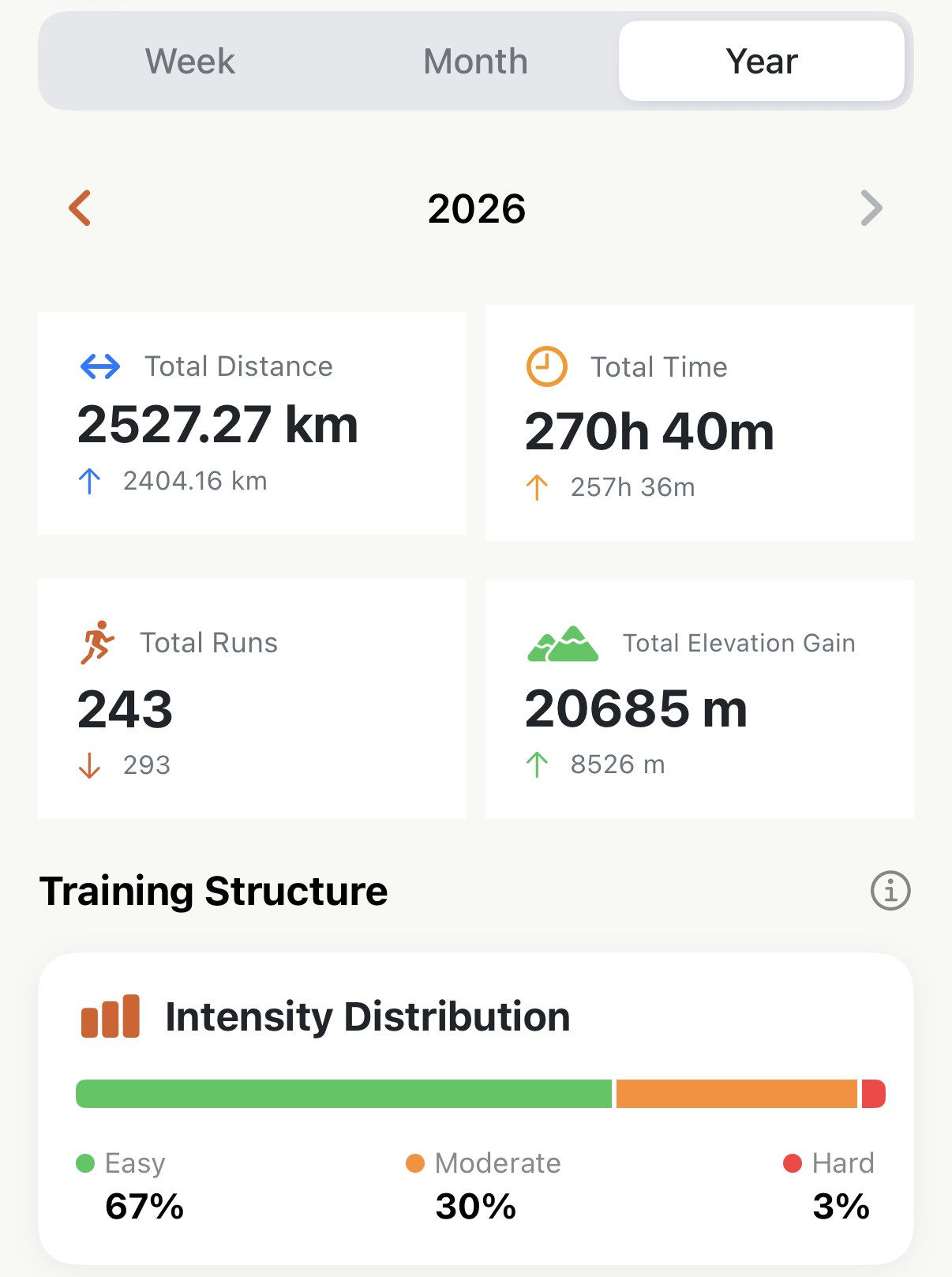
Under the arrows, four cards:
- Total Distance, Total Time, Total Runs and Total Elevation Gain for the period you’re on.
- The small line under each is the same figure for the period before, with an arrow: up if this period is bigger, down if it’s smaller. A month that felt heavy usually was — this is the line that says by how much.
The comparison is always like-for-like: this week against last week, this June against last June. So it’s honest early in a period, too. On the 3rd of the month the distance card compares three days against a whole month, and the down arrow just means the month has barely started.
The charts#
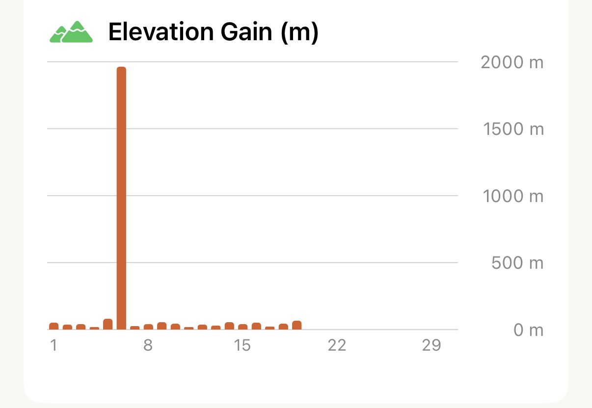
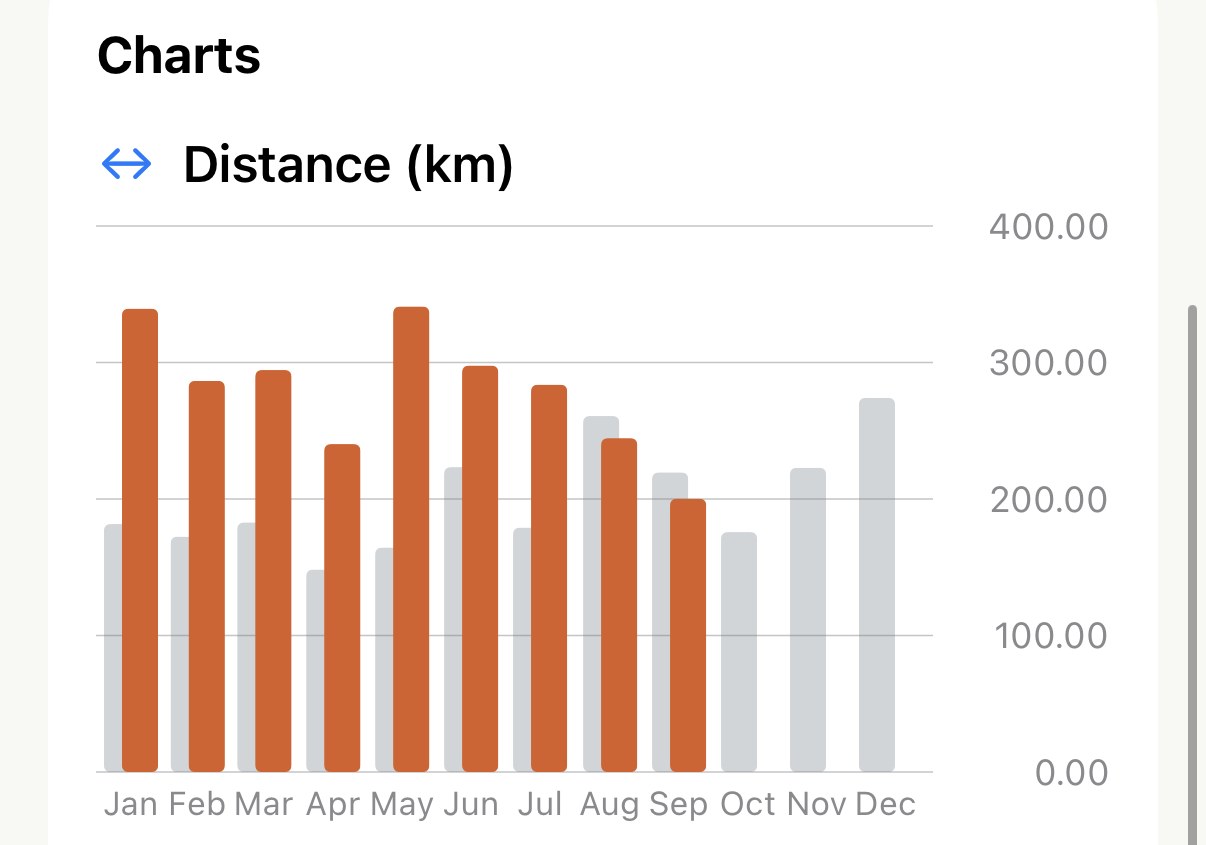
Three bar charts follow: Distance, Time and Elevation Gain. In Week they’re a bar per day; in Month a bar per day of the month; in Year a bar per month. Touch a bar and a marker gives you its date and its figure.
In Week and Year, a grey bar stands beside each orange one: the same day last week, or the same month last year. Two Junes side by side tells you more than either total does. The Month view leaves the grey out, because the 14th of last month doesn’t line up with anything.
The heatmap#
Switch to Month or Year and the screen ends with an Activity Heatmap: a calendar with every day you ran coloured in. The Year view is twelve small months in a grid; the Month view is one month at full size.
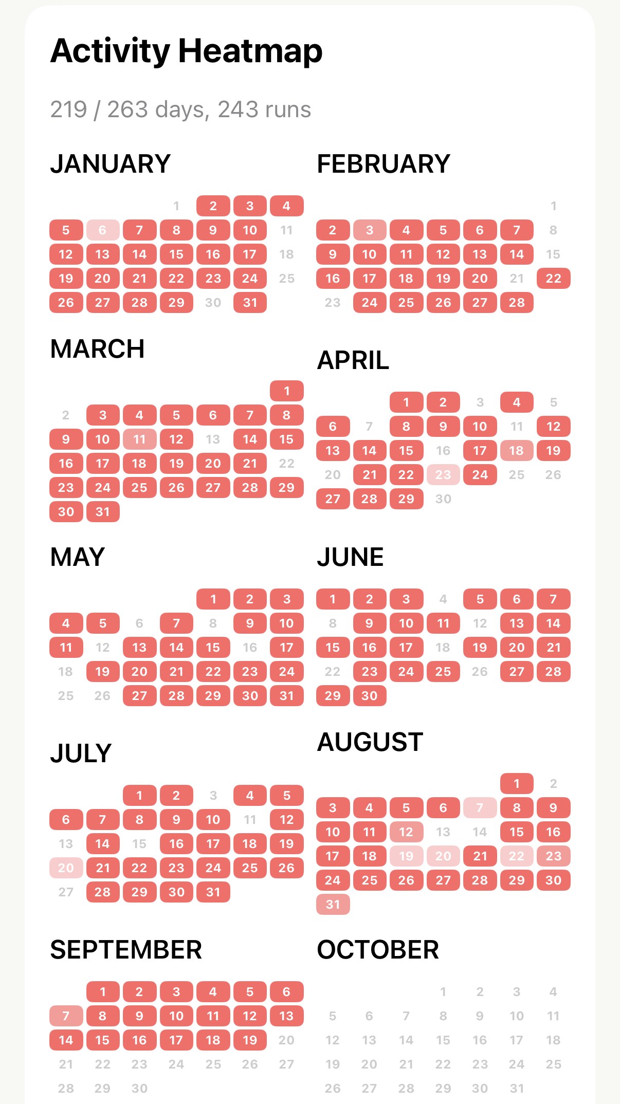
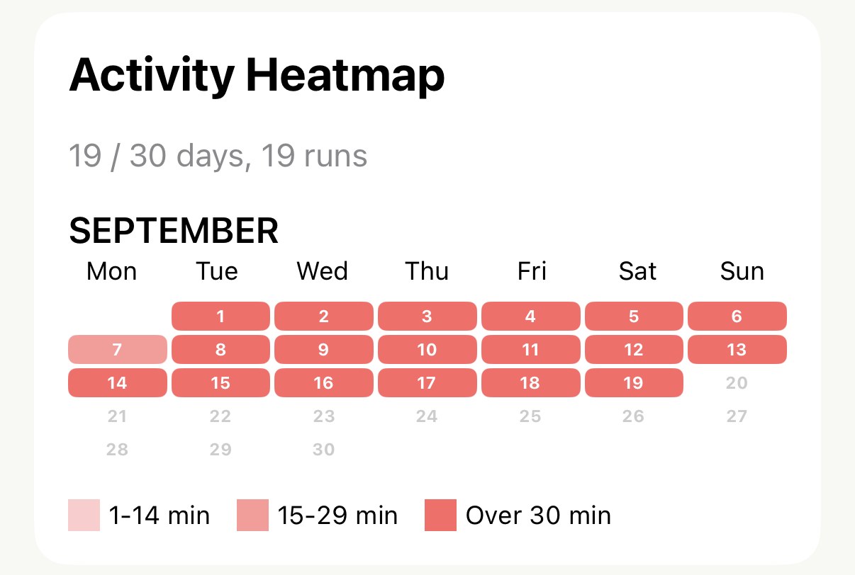
- The colour is how long you ran that day, in three shades. The legend under the grid says which is which. It’s a picture of consistency rather than effort: a light square is still a square.
- The line above it reads
N / D days, R runs— days you ran, out of the days in the month, or for the current year the days there have been so far; then the number of runs. Two runs on a Saturday count once in the days and twice in the runs. - The columns follow your week. Whichever day your week starts on is the first column, the same as everywhere else in the app.
It’s the view to open when a year feels thin. Most people who run three times a week have never seen what that looks like on a calendar, and it looks like more than it feels.
Intensity Distribution, if you have Pro#
Between the four cards and the charts, Pro adds the same Intensity Distribution card that sits on the Summary tab — Easy, Moderate and Hard as shares of your time — but for the period you’re looking at. A single hard week is normal. A year that comes out at 60% easy is the thing to fix.
Worth knowing#
- Everything here is free, and the years are already there. Nothing has to be earned by running with the app — it reads whatever Apple Health has.
- What a week is, is yours to set. Monday or Sunday, under Week Starts On. It moves the Week tab’s boundaries, which column a run lands in on the heatmap, and which week a Sunday long run belongs to.
- Treadmill runs count in distance, time and runs. They add nothing to elevation, because they had none.
- A deleted run leaves every total here, straight away. The delete page has the rest of what happens.
Get the app
See the year you've actually run.
Stats is free and reaches back through every year already in Apple Health — flip to Year, tap the back arrow, and keep going.
↓ Download Apex Run