
See which way your numbers are drifting
A run is one data point, and one data point is noise. Seven days of them is the smallest amount that starts to mean something — which is exactly what these cards hold, and why they're at the bottom of the screen rather than the top.
Scroll to the bottom of the Summary tab and you reach Recent Trends: a grid of small cards, each carrying one number for the last seven days. They’re free, and there’s nothing to switch on.
What you’re looking at#
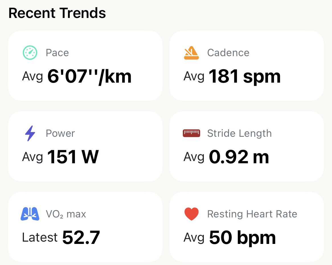
Up to six cards, two across:
- Pace — the average across your last seven days’ runs.
- Cadence, Power and Stride Length — the same, for runs that recorded them.
- VO₂ max — not an average but the latest reading, because it moves slowly and the newest one is the one that counts.
- Resting Heart Rate — the seven-day average, including days you didn’t run.
Seven days means the last seven days, ending now. It isn’t the calendar week Weekly Stats counts, so it doesn’t empty out on Monday morning; it just rolls along behind you.
A card that isn’t there isn’t broken. Each one appears only when there’s something in the week to average. No watch on your runs and there’s no cadence card; no power meter and there’s no Power. They come back on the first run that records the number.
How to read them#
Pace is an average of runs, not of kilometres. Two short sessions of strides and one long easy run average out to a pace quicker than most of that week actually was. Before you read a fast week off this card, remember what the runs were.
Resting heart rate is the card to glance at first. It’s the one number here that measures you rather than a run, and it reads a few beats high when you’re carrying fatigue or coming down with something. It won’t tell you what to do about it — the Recovery card higher up the screen is for that, and it adds last night’s sleep and HRV to the reading — but it’s the earliest signal on the screen, and it’s free.
VO₂ max and cadence are slow. Cadence settles over months of running, not days, and VO₂ max is Apple Health’s estimate, which moves by tenths over weeks. Don’t expect either to react to one run — and if they do, the run is the reason, not you.
Tap a card for the long view#
Every card opens the Trends screen, scrolled to that metric, with a row across the top that stretches the same number over 1W, 1M, 3M, 6M or 1Y. Every run becomes a point on the line, and tapping any point reads its date and value.
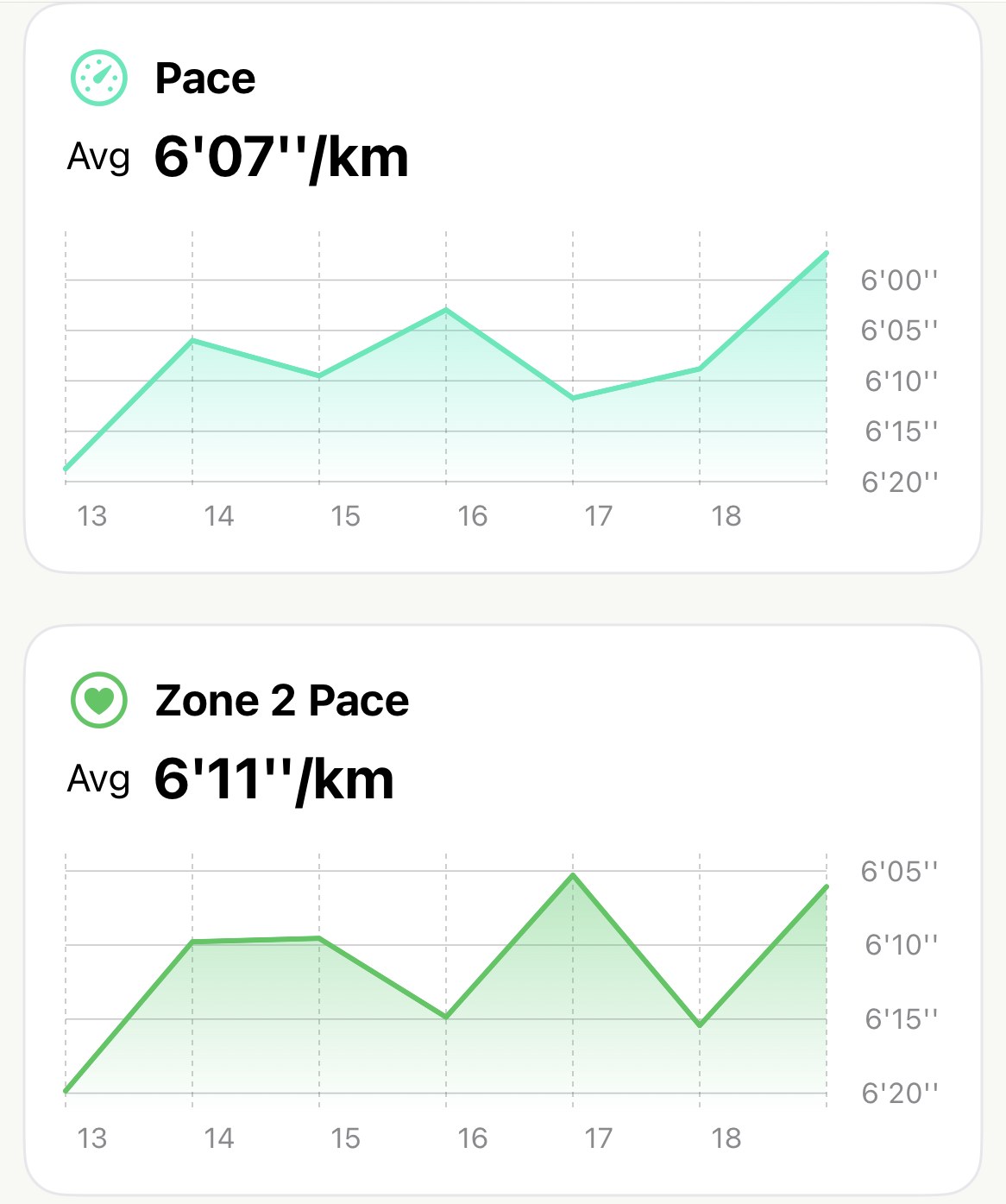
The month view is where the drift shows. A week is short enough that one bad day tilts it; three months is long enough that a slow slide in resting heart rate, or a cadence that has quietly settled higher, reads as a shape rather than a wobble.
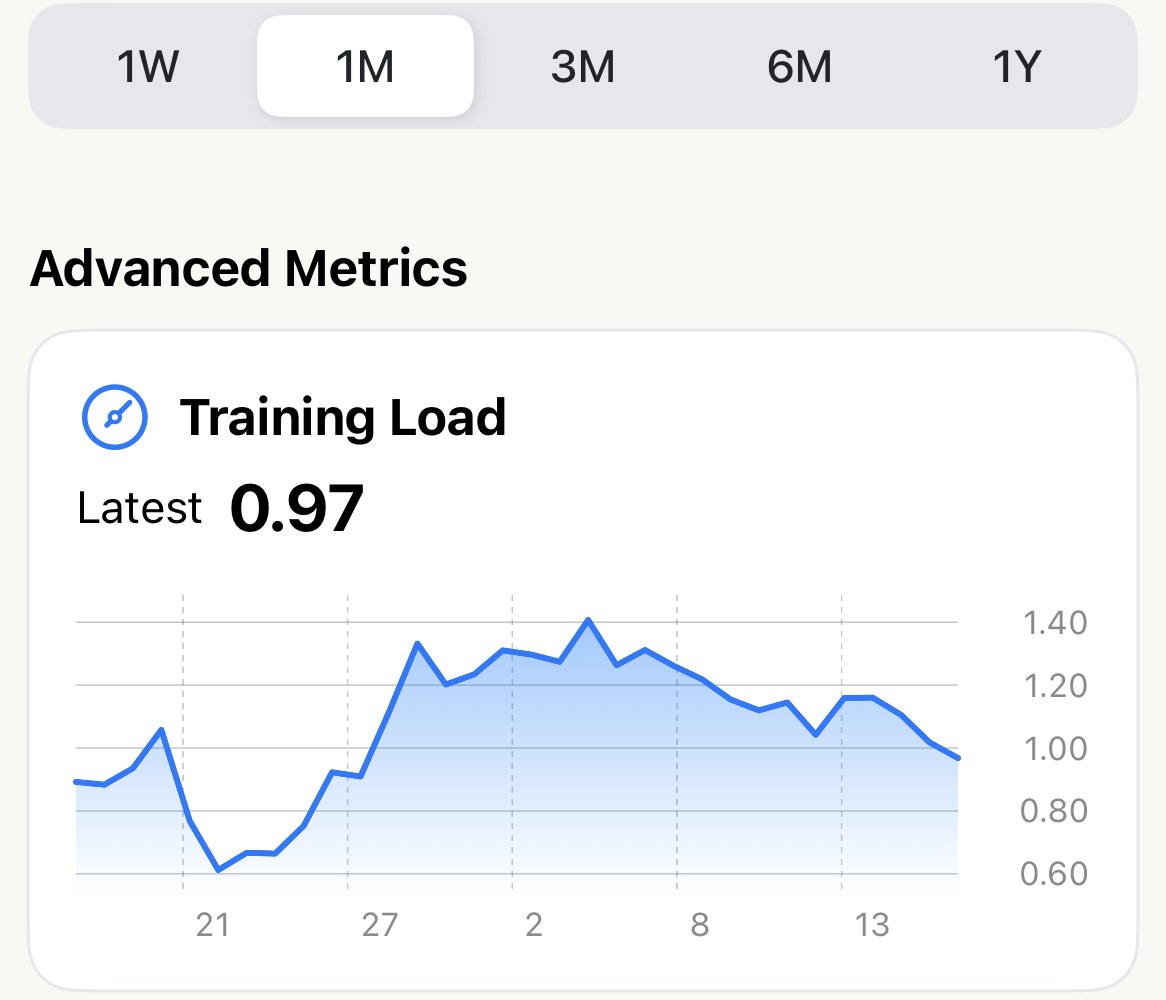
The Trends screen has a little more than the six cards. Zone 2 pace is there for everyone, and with Pro an Advanced Metrics block sits at the top with Training Load and Efficiency Factor plotted the same way — that’s the card in the month picture.
Worth knowing#
- Pace follows your settings. It reads per kilometre or per mile according to Distance Unit. Stride length is always in metres.
- VO₂ max and resting heart rate come from Apple Health, not from your runs. If Apple Health has no readings, the cards stay away; if it has them from another app or watch, they count.
- Two runs on one day become one point on the Trends line, averaged together, though both count in the seven-day number. A run that recorded no cadence is simply left out of that card, not counted as zero.
The metric behind it: Why fitter runners have lower resting heart rates, and what it does to Zone 2
Get the app
Seven days, six numbers.
The cards fill themselves from runs already in your library and readings already in Apple Health — nothing to log, nothing to buy. Glance at them once a week, and tap the one that moved.
↓ Download Apex Run