
Open one split and see what happened in it
One row in the table is slower than the rest, and the row can't tell you why. Tap it. The split opens with everything the run knows about that stretch — and usually the answer is sitting in the first fifteen lines.
The splits table shows you which kilometre was slow. This screen is for why. Tap a row — in Splits, in 5K Splits, or under Segments if your watch recorded laps — and that one stretch gets a page of its own.
The lines at the top#
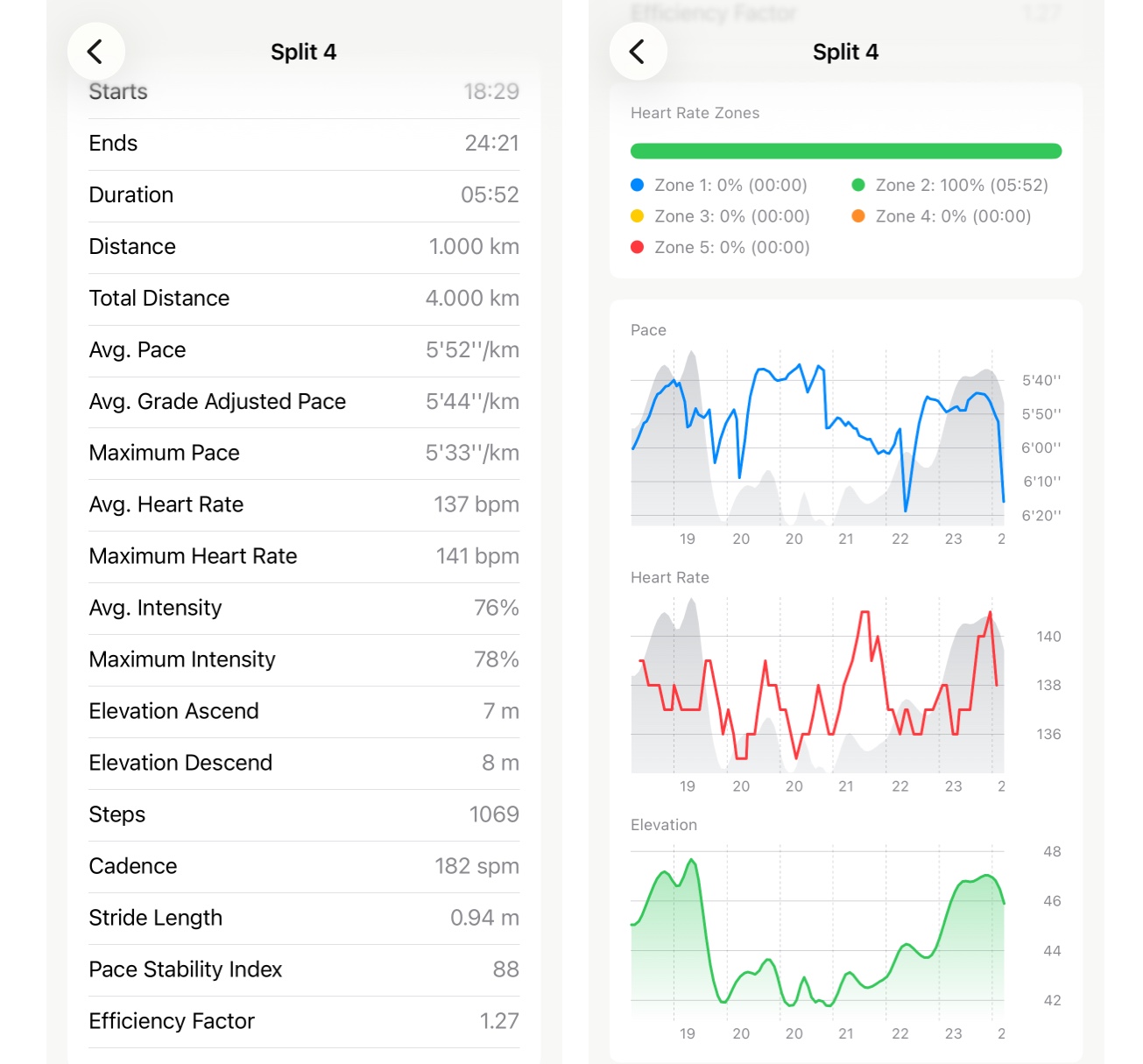
The rows read top to bottom in the order you’d ask about them:
- Starts and Ends are minutes into the run, not the time of day — 18:29 to 24:21 means this was the stretch just before the twenty-five-minute mark. Handy when you’re matching a split to the heart rate trace on the run page.
- Total Distance is where in the run you were when this split ended, so you don’t have to count rows.
- Avg. Pace and Maximum Pace — the average is the row you tapped; the maximum is the fastest moment inside it. A big gap between the two means the kilometre wasn’t run at one speed.
- Avg. Grade Adjusted Pace is the same kilometre as if it were flat. When it’s faster than the pace above it, the hill is the reason. There’s a whole page on reading that difference.
- Heart rate and intensity — average and maximum for the split, then the same two as a percentage of your Max HR. 76% is the number to compare across splits, because it means the same thing whether your maximum is 175 or 195.
- Elevation Ascend and Descend, separately. The run page gives you the whole climb; this is the climb inside one kilometre, and it’s the most common answer to “why was this one slow”. Twenty seconds off your average with 30 m of ascent in it wasn’t a bad kilometre.
- Steps, Cadence and Stride Length for that stretch alone. Cadence holding while stride shortens on a climb is the normal picture. Both dropping is the one to notice.
Two more rows appear with Pro: Pace Stability Index and Efficiency Factor, worked out for this split rather than the run. They’re the ones to open when a run scored low on stability and you want to know which kilometre did it.
The zone bar and the charts#
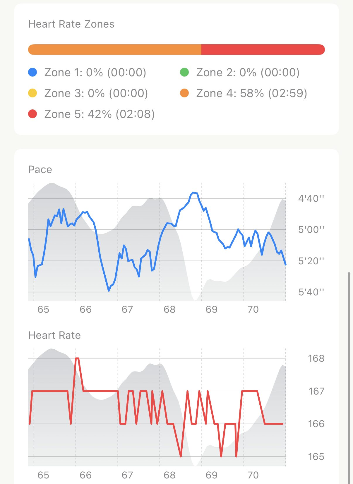
- Heart Rate Zones is the run’s zone bar, cut down to this split. If the watch lost your pulse for part of it, a grey Missing Data line says how long, the same way it does on the run page.
- Pace, Heart Rate and Elevation each get a chart zoomed to the split, which is where the detail actually shows. On the run page a kilometre is a sliver of the trace; here it’s the whole width.
- Touch a chart and a marker follows your finger with the value and the time, so you can put a number on the exact moment the pace dropped.
The elevation profile is drawn faintly behind the pace and heart rate lines too. Most of the time that’s all you need: the pace line dips exactly where the grey rises, and the question answers itself.
Worth knowing#
- Everything on this screen is free except the two Pro rows. It works on every run already in Apple Health, however old.
- A treadmill split has no elevation rows, no GAP and no elevation chart — there’s no route to take them from. Pace, heart rate, cadence and stride are all still there.
- A very short split has no charts. Anything under a minute — usually the last few hundred metres of a run — shows the rows only; there isn’t enough of a line to draw.
- Intensity uses the Max HR in your settings. If it looks wrong on every split, the fix is in your zones, not the run.
- Don’t read the first split too hard. GPS settles over the first few hundred metres, so kilometre one has the least trustworthy pace and elevation in the run.
Why it was built this way: Splits, all the way down
Get the app
Find out what kilometre seven was about.
Every split on every run opens like this, free — including the runs already in Apple Health from before you had the app.
↓ Download Apex Run