
See what last month actually added up to
Four numbers went down last month and it was still one of the better months — lower volume, five new bests. A month is hard to judge while you're inside it, which is why the report waits until it's over.
Every finished month gets a report. It’s always the month before this one — never the one you’re in the middle of — because half a month of totals isn’t something worth comparing to anything.
It costs nothing, and there’s nothing to switch on.
Finding it, and why it sometimes isn’t there#
There are two ways in, and only one of them is permanent:
- Profile — the report card lives here all the time. If you want last month’s report on the 25th, this is where it is.
- Summary — a card appears near the top, but only during the first seven days of a month — and once you’ve opened it, that month’s card doesn’t come back. A new one turns up at the start of the next month.
So the Summary card is a nudge, not the feature. If you saw a monthly report card once and can’t find it again, you didn’t lose it — it did its job and stepped aside. Profile still has it.
The Hero Moment is your longest run#
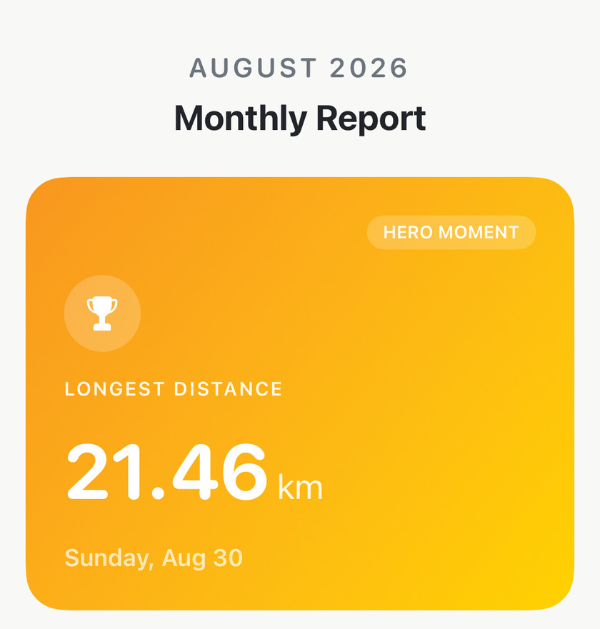
The gradient card at the top picks one run out of the month: your longest distance, with the date you ran it — or, if the month had a serious climb in it, that run instead.
Worth knowing so you don’t go hunting for a meaning in the choice. It’s picking the biggest thing you did, not reading anything into how you trained.
Four totals, each against the month before#
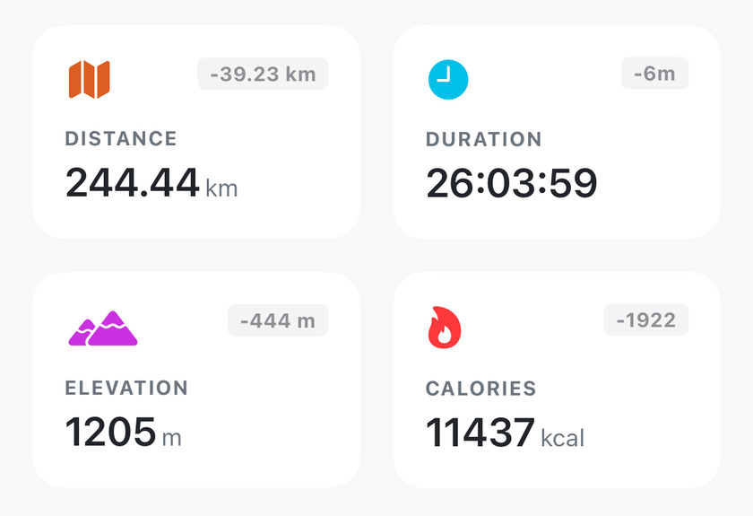
The small grey figure on each card is the change from the previous month, in the same units as the card. Not a percentage, not a target — just the arithmetic.
All four can be negative in a month you should be pleased with. The month above lost 39 km, six minutes, 444 m of climbing and 1,922 kcal, and also produced a half marathon and five best efforts. Read the deltas as what changed, and let the rest of the report tell you whether it mattered.
Achievements, ranked against everything you’ve ever run#
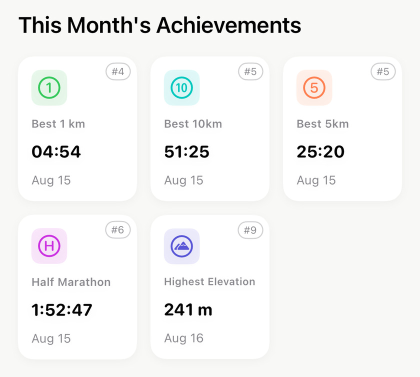
A month with no best efforts in it has no Achievements section — the whole block is skipped rather than shown empty, so don’t go hunting for it.
This is the section people misread. #4 does not mean the fourth-best thing you did in August — it means that 1 km is the 4th fastest you have ever run, across your entire history.
That reframes the whole card. A #9 isn’t a poor showing; it means that out of every run you’ve ever recorded, this one cracked your top ten. The badge styling follows:
- #1, #2, #3 get a filled gold, silver or bronze capsule. A gold
#1is an all-time personal best. - #4 to #10 get a plain outlined badge.
- Anything outside your top ten isn’t badged.
Training Analysis: the shape of the effort#
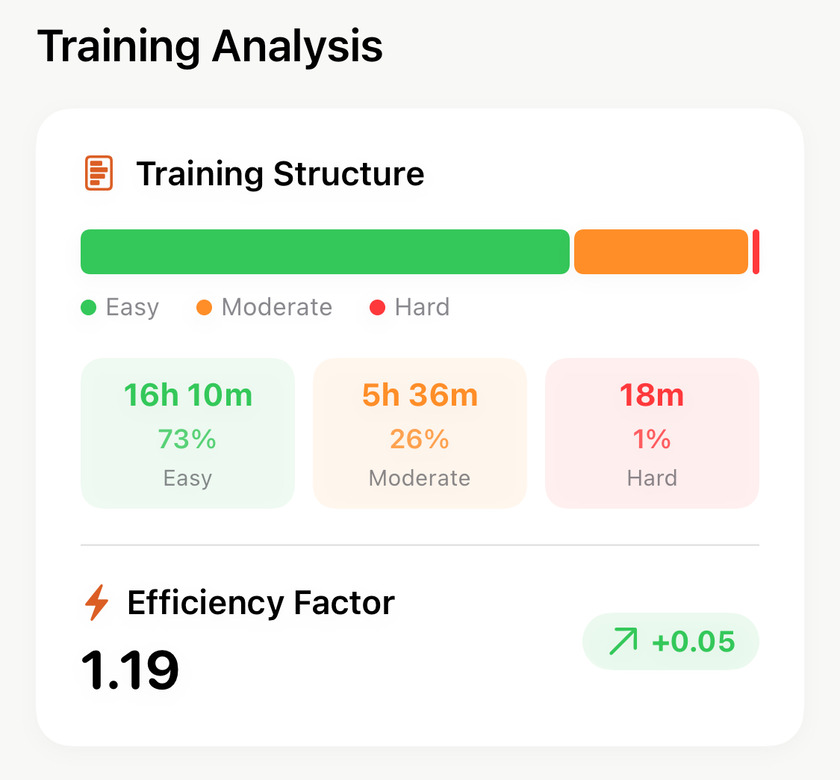
The bar splits the month’s time — not its distance — into Easy, Moderate and Hard, read from your heart rate zones. Time, not runs, is the honest denominator: one hard interval session is twenty minutes inside a twenty-hour month.
Most well-built months sit somewhere near 70–85% easy. The 73/26/1 above is a base month that did its job.
Efficiency Factor underneath is the one number here that answers am I getting fitter? It’s how much ground you cover per heartbeat, and it’s built on your grade-adjusted pace, so a hilly month isn’t punished for being hilly. The figure beside it is the change from last month, and that comparison is the point — the absolute value only means something against your own history.
Performance Trend, if you run with a watch#
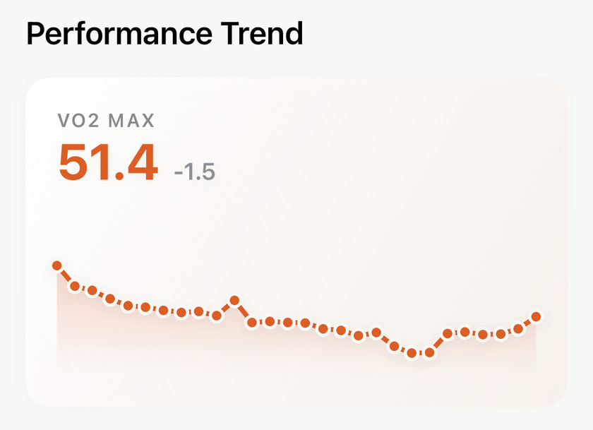
Apex Run doesn’t estimate VO₂ Max — it reads whatever Apple Health already holds, which in practice means your Apple Watch put it there. Run with your phone alone and this section isn’t there at all, which is the right answer rather than an empty card.
The big figure is your most recent reading of the month, not an average. The small figure beside it is that reading measured against the first of the month — movement within the month, not against last month — and it only appears when the month holds at least two readings, because one reading has nothing to be compared to.
A decline shows in grey rather than red, and that’s deliberate: VO₂ Max drifting down through a month of easy volume is what a base block looks like, not a failure. The dots below plot every reading in the month, so you can see whether the number moved steadily or just wobbled.
Apex Insights#
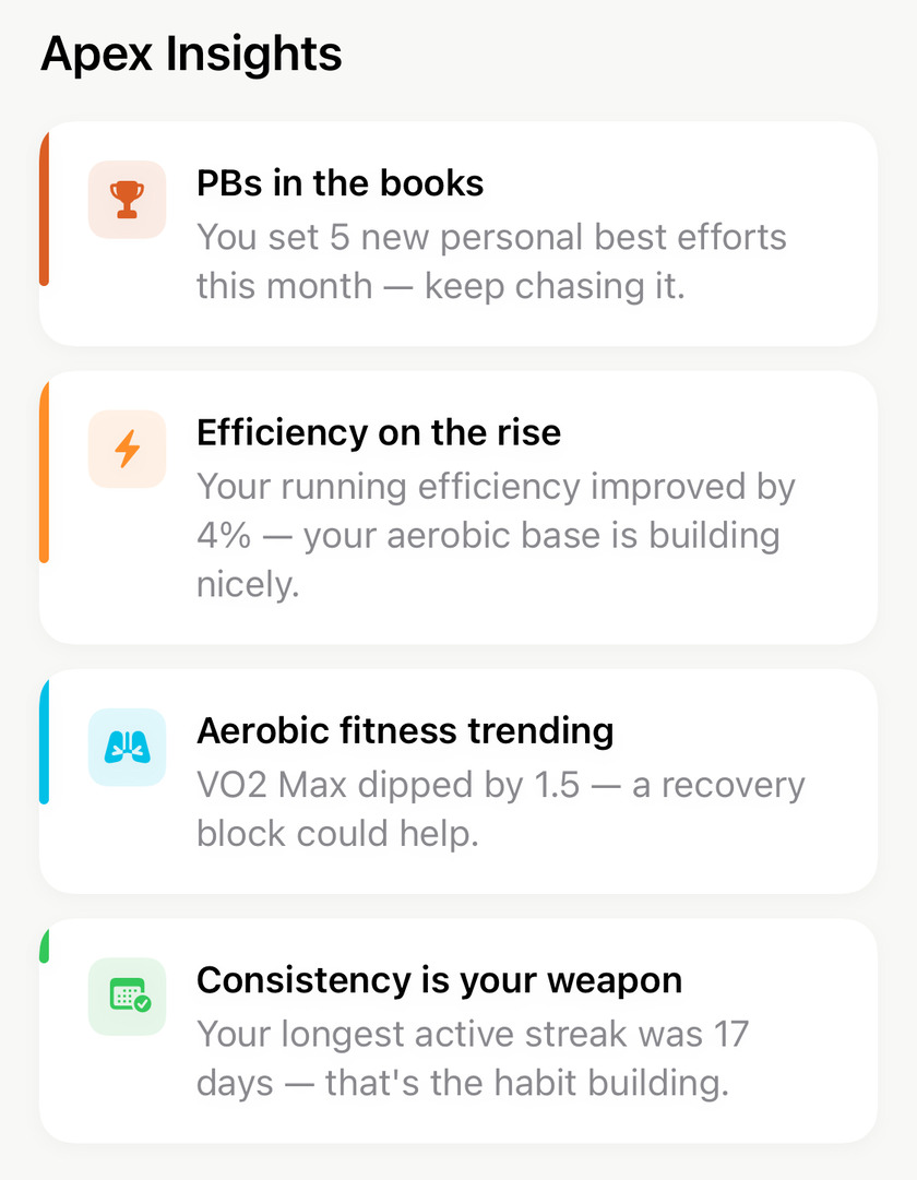
Four short cards at the bottom of the report. There’s nothing to tap and nothing to set up — this is the report reading itself back to you.
Read them as a caption on the numbers above, not as a verdict. Every card is earned: there are seven Apex Run can write and it shows the four most notable, so a card is only there because something actually happened. The other side of that is worth knowing — if a change you noticed isn’t mentioned, it was crowded out rather than missed. A quieter month brings the quieter observations to the surface.
Most of the four just tell you what happened. Two of them make a suggestion: a dipping VO₂ Max proposes a recovery block, and falling efficiency proposes more easy running. If you only act on one thing from this screen, act on those.
Routes This Month#
The last section draws every outdoor run of the month onto one map, each line coloured by its run type, with a count of the runs in the corner. Indoor runs aren’t on it, having no route to draw. You can pan and zoom it — and it’s worth doing before you share, for the reason in the next section.
Sharing it#
The button at the bottom is Share Full Report, and what it hands you isn’t a summary card — it’s the entire report rendered as one tall image at your screen’s full resolution, ready for the iOS share sheet. It takes a moment and says Generating High-Fidelity Report while it works.
Two things worth knowing before you tap it:
- Frame the map first. The routes map in the exported image is captured at whatever position you left it on screen. Pan and zoom it the way you want it before hitting Share, and the export follows. Leave it alone and you get the default fit, which on a month of runs in one city is a lot of empty map.
- The export is always light. Even if you run the app in dark mode, the shared image renders light, so it looks the same to whoever you send it to.
Get the app
Last month is already written.
The report builds itself from runs you've already imported, so there's one waiting for you right now — no setup, no Pro. Look at the deltas first, then the achievements.
↓ Download Apex Run