
Find the run you're thinking of
You remember a run as the hilly loop, or the long one out along the river. You don't remember it as 11.95 km on the 9th. Grid view lets you look for it the way you actually remember it.
Your run history has two layouts, and the button that swaps them is the one in the top-right corner. It shows the view you’d get by tapping it, not the one you’re in — so a grid icon means “go to grid”, and a list icon means “come back”.
Apex Run remembers which one you chose, including next time you open the app.
The list, when you want the details#
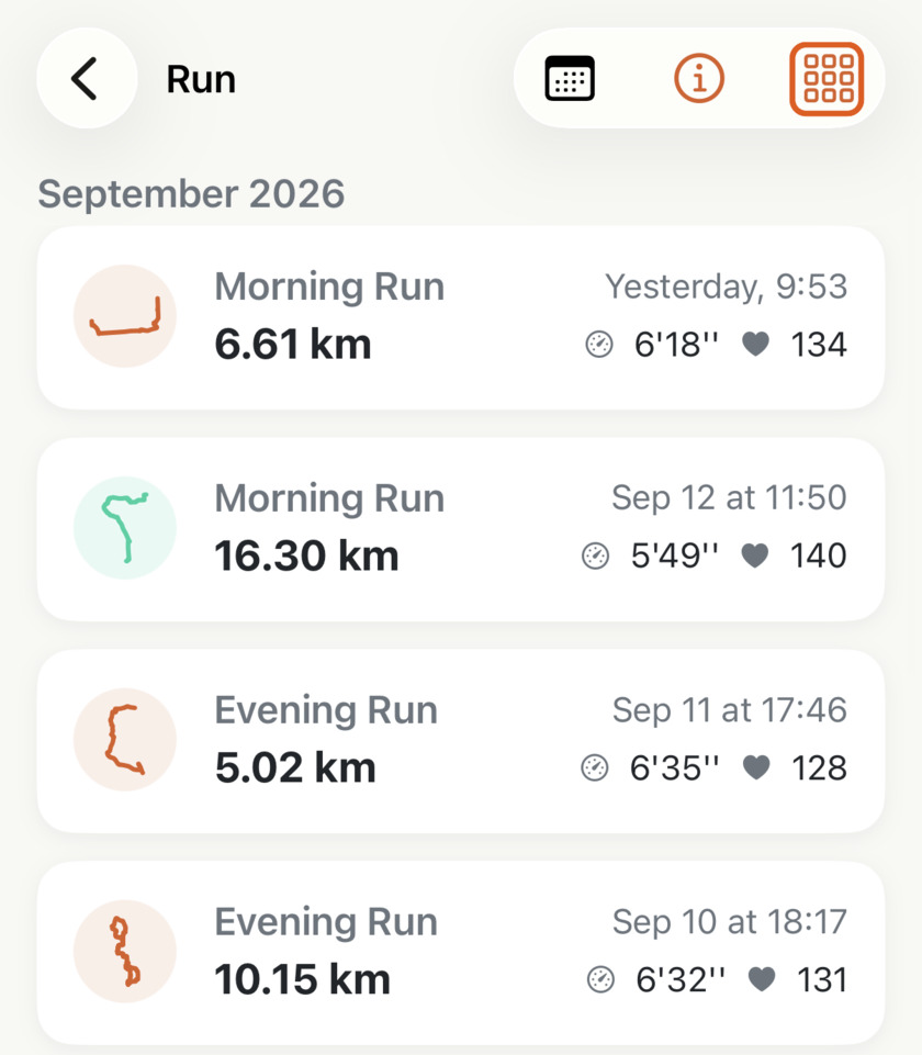
Every row carries the run’s name, its date and the time of day, the distance in large type, and the two metrics you picked. The little route sits in a tinted circle on the left, coloured by run type.
That’s the view to be in when the answer you want is a number, or when the time of day matters — telling Tuesday’s lunchtime 10 km from Thursday’s evening one takes reading a single line.
It’s also the only view that shows run names. If you rename your runs — Parkrun, HuaShan, hill reps — the list is where those names live.
The grid, when you want to recognise it#
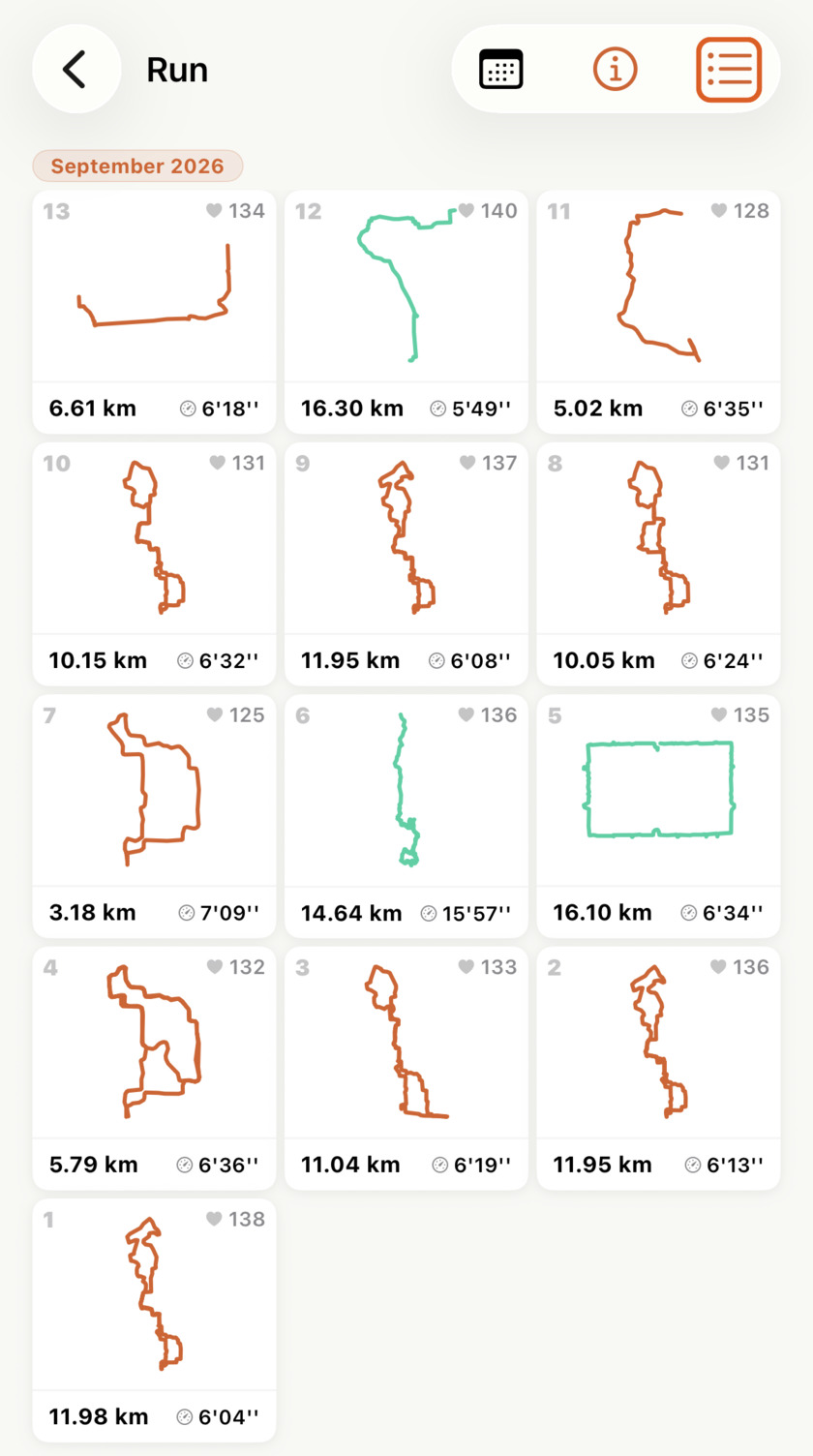
Three cards across, square, each one mostly GPS route. Same month as the list above — thirteen runs instead of four.
Each card gives you the day of the month in the top-left, your route drawn large and coloured by run type, and along the bottom the distance with one of your two metrics. The other metric moves up to the top-right corner.
This is the view for which run was that? A month of running laid out as route drawings is a page you can scan, and the answer is usually obvious before you’ve read a single number — the square one was the track session, the long thin one went out along the river, the tangle in the middle was the neighbourhood loop.
Runs with no route to draw fall back to an icon: indoor runs get a treadmill mark, and an outdoor run whose GPS didn’t record gets its run-type icon. A grid of mostly icons is the honest signal that grid view isn’t for you.
Your two metrics follow you, rearranged#
Both layouts show the same pair you chose in Profile→Settings→Run List Display , and distance is always one of them. What changes is where they sit.
In the list they read left to right, in the order you switched them on. In the grid the first one you turned on goes along the bottom beside the distance, and the second moves to the top-right corner in smaller grey type — so the one you care about more is worth switching on first.
Everything else is the same in both#
This is a low-stakes choice, because the switch only changes the layout:
- Months are headed the same way and stick to the top of the screen as you scroll — a plain heading in the list, a small orange pill in the grid.
- Tapping any run opens the full run, from either view.
- Long-pressing any run offers Delete, from either view.
- The calendar button beside the toggle jumps you to any month, from either view.
- Filtered lists use your choice too. Open Long Runs from Run Insights and you get whichever layout you last picked.
Which one to leave it on#
Pick by how you run, not by which looks better:
- If your runs are mostly the same route, stay in the list. Thirty near-identical shapes tell you nothing, and you lose the names and times for no gain.
- If you run in different places, try the grid for a week. The moment you go looking for “that run by the lake” and find it in two seconds without reading a date, you’ll know.
- If you’re checking a number — what you paced last Sunday, whether your heart rate was high — switch to the list for that one look and switch back. It’s one tap, and the app won’t argue with you.
Why it was built this way: Your runs, drawn
Get the app
One tap, and it stays that way.
Both views are free, and Apex Run remembers the one you picked — so this is a ten-second decision you make once. Try the grid on a month where you ran a few different places.
↓ Download Apex Run