
A share card that shows the intervals, not the average
You ran eleven hard efforts with a jog between each. A card that says 5'12'' average pace hides all eleven. This one shows them.
Most share cards were designed for one kind of run: a single steady effort with one pace. An interval session isn’t that. It’s two things alternating, and the average of the two describes neither. Apex Run has two cards built for it, and they appear in the picker on their own when a run has intervals in it.
Where the cards are#
Open the run, tap ⋯, then Share. The picker, Select a Share Template, scrolls sideways through the cards this run can have, opened on the one you used last. Tap a card, then Share, and the finished image goes to the iOS share sheet.
The interval card#
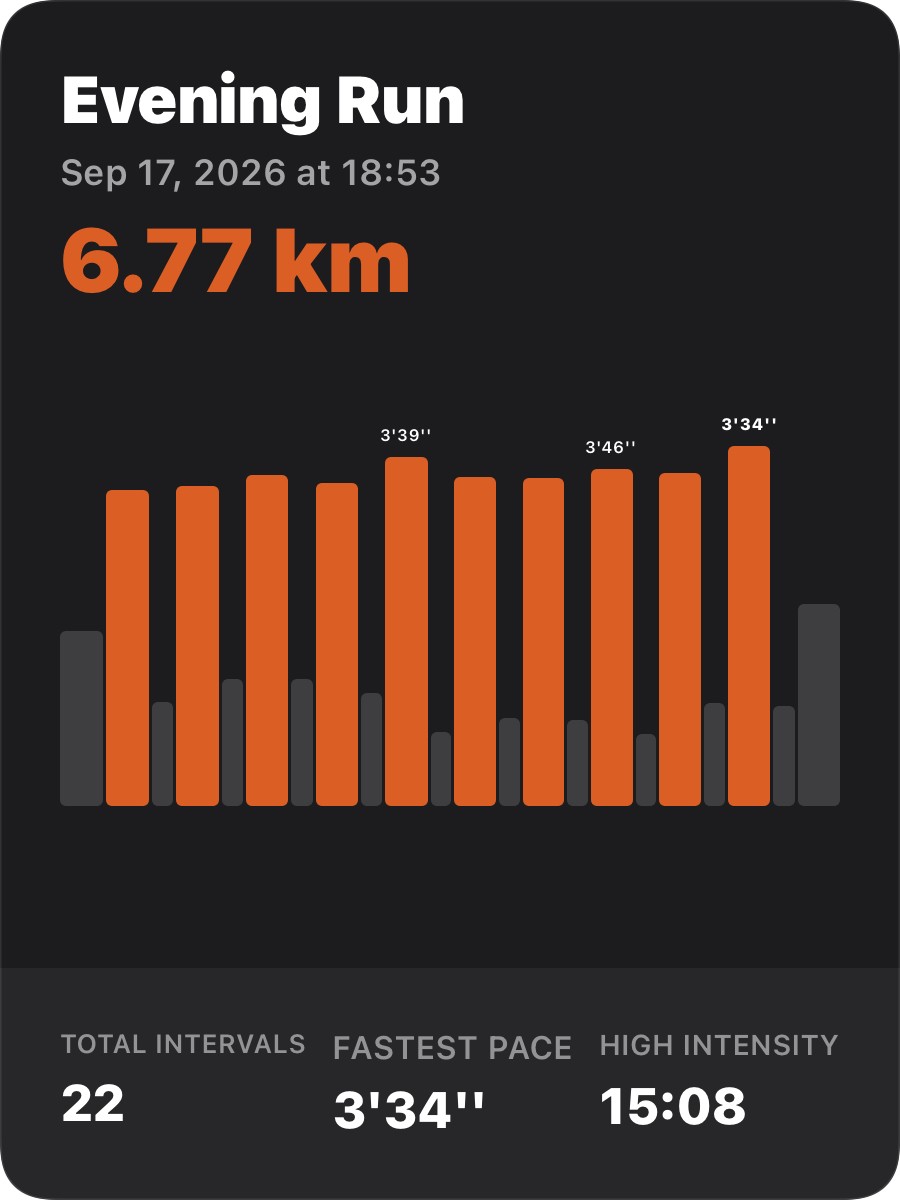
One bar per interval, efforts and rests alike, left to right in the order you ran them. A bar’s height is its pace, taller is faster, and its width is its distance, so a long rest jog is a wide low bar and a 400 m rep is a narrow tall one. Bars run faster than the session’s average are orange; the rest are grey. The three fastest efforts carry their pace above the bar, the fastest of all in bold.
Three numbers underneath:
- Total Intervals counts every bar, efforts and rests both. Eleven efforts with a rest after each is twenty-two.
- Fastest Pace is the best single effort.
- High Intensity is the time spent in the orange bars, added up. It’s the number that separates a session with 15 minutes of real work from an easy run of the same distance.
The card is portrait, three by four, with no map, so it works for a treadmill session as well as the track.
The outdoor interval card#
For an outdoor run with a route there’s a second card further along the picker, with the map behind it. The same bar chart sits at the top, and under the distance a two-column table puts the two halves of the session side by side: Work Pace next to Rest Pace, Work HR next to Rest HR, Work Time next to the whole Duration, then cadence, stride, calories and power for the run as a whole. A heart-rate zone strip runs across the middle, and the weather sits by the date.
It reads like the workout was structured, because it was. The map behind it uses the style set under Share Map Style in General Settings, standard or satellite.
Worth knowing#
- The cards come from the structure, not the run type. They appear when the watch recorded the session as intervals, an Apple Watch custom workout for instance, or when the run has Segments from laps you pressed. A plain run with fast and slow kilometres doesn’t get them, even one the app labelled Interval; there’s nothing to draw the bars from.
- Orange is relative to this session. An easy-day fartlek gets orange bars too, because its efforts are faster than its own average. The colour says effort or rest, not fast or slow in general.
- Every share card is free, these two included.
Why it was built this way: A share card that actually shows the workout
Get the app
Share the session, not the average.
Every share card is free. The interval cards appear on their own for any run with intervals from the watch, or with Segments.
↓ Download Apex Run