
Your week and your last run, on the Home Screen
Shoes off, phone up, and the run you just finished is already on the Home Screen next to how the week is going. No app to open, nothing to pull down.
Most of what you want from a running app is a one-second question. How far was that? Where is the week at? Those don’t deserve an unlock, a tap and a scroll, so Apex Run puts the answers on the Home Screen and keeps them current there. Three widgets, all free: Latest Run, Weekly Stats, and a large Weekly Dashboard that is the two of them on one card.
Adding one#
Long-press an empty patch of the Home Screen, tap Edit and then Add Widget (on older versions of iOS, the + in the corner), and search for Apex Run. Four widgets come up: the three on this page, and the metronome’s. Latest Run and Weekly Stats each come in small and medium; the Dashboard is large only.
Every widget on this page is configurable after it’s placed: long-press it, tap Edit Widget, and the choices below appear. That’s also the answer if a widget shows a metric you don’t care about.
Latest Run#
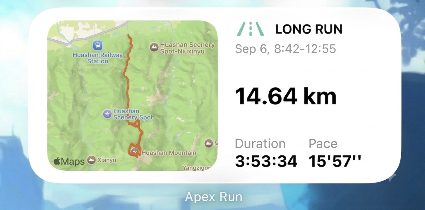
The run that finished most recently, exactly as the card at the top of the Summary tab has it:
- Its type, with the icon and colour the run carries in the app. If the run has no type yet, the label just says Latest Run.
- When. Today, 17:26–18:35, Yesterday, then the date. The two times are the clock at start and finish.
- Distance, big, in your units.
- Two metrics of your choosing. Out of the box they’re Duration and Pace. Edit Widget offers Duration, Pace, Avg Heart Rate, Calories, Power, Stride Length and Cadence for each slot.
The medium size adds the map. For a moment after a new run lands you may see the route drawn as a plain shape on a grey tile; that’s the run’s own route, drawn before the map imagery has arrived, and the map takes over once it has. A treadmill run has no route, so its map slot reads No map data.
Tap the widget and the app opens straight onto that run.
Weekly Stats#
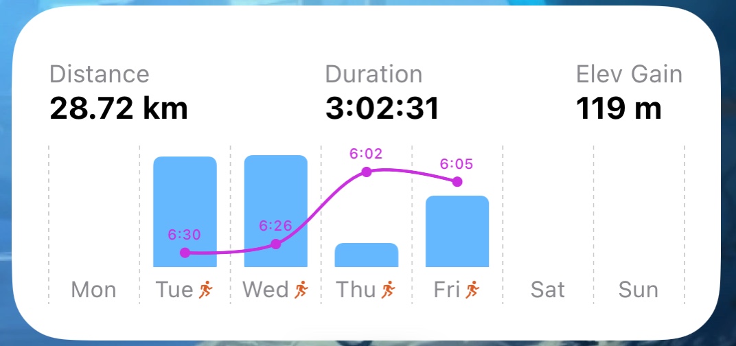
This week so far, on the same week boundary the app uses:
- The totals. Distance, Duration and Elev Gain for the week, plus a count of runs. The small size is just these.
- A bar per day, in the medium size, showing that day’s distance, with the run type’s icon under any day that has one. Empty days stay empty, so a rest day looks like one.
- A curve over the bars, one point per day you ran. It starts as Avg Heart Rate; Edit Widget switches it to Avg Pace, Avg Power, Avg Cadence, Avg Stride Length, or off, and there’s a switch for the little value labels on each point.
The curve is the reason to keep the medium size. Bars tell you how much; the line tells you how it felt. A week where the bars grow and the heart rate line stays flat is a good week, and you can see that from the Home Screen without a single tap.
Tap the widget and the app opens on Stats, where the same week sits beside the month and the year.
Weekly Dashboard#
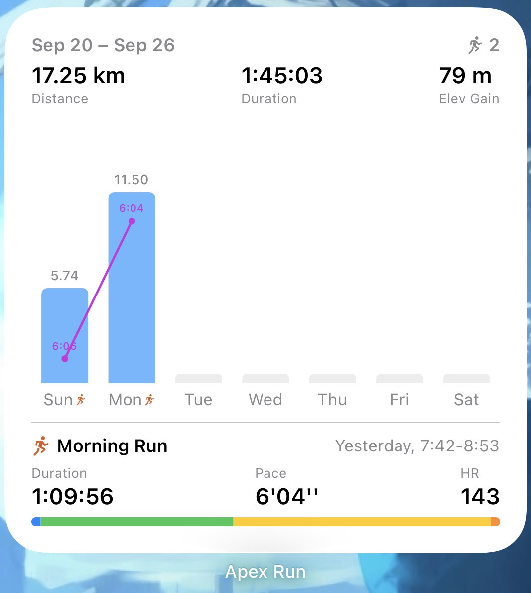
The large one. The top half is Weekly Stats with a little more room: the week’s date range, the run count, the three totals, and the bar chart with each bar’s distance written above it and the curve over the top (Avg Pace to start with). Under a divider, the bottom half is Latest Run: its name, when, three metrics rather than two, and a thin bar showing how its time split across your heart rate zones.
Edit Widget picks the curve and all three metrics. Tapping it opens Stats.
If you only want one Apex Run widget on the phone, this is the one: the whole week and the last run in a single glance, and everything on it is a tap from its full screen.
It keeps up on its own#
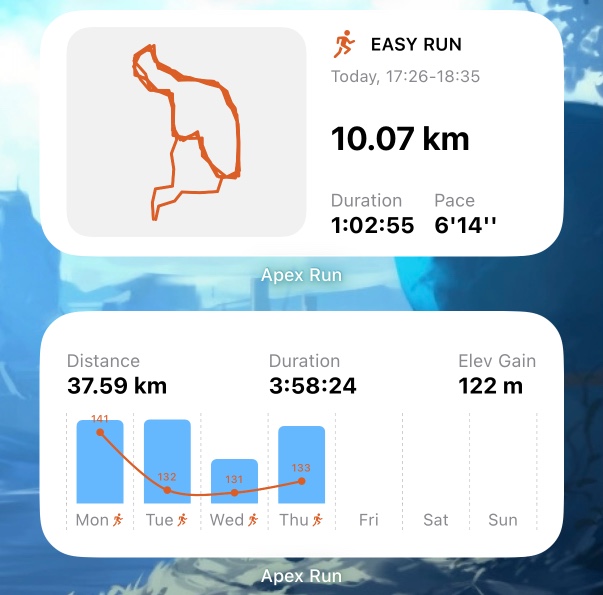
Finish a run, and the widgets normally have it within a minute or two of the watch saving it, app closed. That’s the whole point of them: the numbers on your Home Screen are the numbers, not a snapshot from the last time you opened the app.
Two things to know so you can trust it:
- If the new run isn’t there when you look, it will be on the widget’s next check, which is never more than about half an hour away. Opening Apex Run brings it up to date immediately, as does pulling down on the Summary tab.
- The week rolls over when the app next has a reason to look: a new run landing, or you opening it. On the first morning of the week, Weekly Stats may still be showing last week’s totals until then; open the app once and it’s on the new week.
Worth knowing#
- Units and the week’s first day follow the app. Change either in General settings and every widget follows.
- The metric pair doesn’t. Run List Display sets the metrics on the run list; each widget carries its own, set through Edit Widget. A fresh Latest Run widget starts on Duration and Pace whatever the list shows.
- All three are free. No Pro gate, no trial.
- The metronome has its own small widget, with − and + to set the step rate and a Start button. It’s on the metronome page.
Why it was built this way: Your Home Screen keeps up now
Get the app
Put the week where you'll actually see it.
The widgets are free and there's nothing to set up beyond adding one. They build themselves from the runs Apex Run has already synced, and they keep up with new ones on their own.
↓ Download Apex Run