
Read the heart rate on any run, gaps included
You know the run felt hard. The heart rate sections tell you how hard, and for how long — and when the watch lost you for eleven minutes, they say so rather than making something up. Which is the part worth knowing how to read.
A run has one pace and one distance, but its effort is a shape: easy for the first half, a climb that pushed you into Zone 4, the last kilometre in Zone 5 because you could see the finish. Two sections on every run draw that shape. Heart Rate Zones condenses it to a bar and six lines of minutes. Heart Rate underneath draws the whole trace, so you can find the exact minute the climb started.
Both need a heart rate to have been recorded — a watch on your wrist, or a chest strap paired to it. A phone-only run has neither section, and nothing else on the run page changes.
The zone bar#
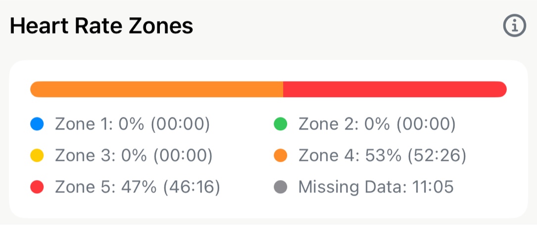
Scroll past the splits and the bar is the first thing in the section. Each colour is one zone, and its width is the share of the run you spent there. Under it, one line per zone:
- The percentage is that zone’s share of the time the watch measured. The five always add to 100.
- The time in brackets is the minutes and seconds you actually spent there. Paused time is already taken out, so a wait at a crossing with the watch paused counts for nothing.
A run that was all easy running is one wide green bar with a sliver of something else at each end. A tempo run is mostly Zone 3 and 4 with a warm-up and cool-down at each end. Intervals show as a split between the top and the bottom, with little in the middle. You get used to reading the bar before the numbers — it’s the fastest read of a run’s effort on the page.
The zones are the ones you’ve set. Tap the ⓘ in the corner and you’re in Zone Settings, the same screen as Settings → Customize Zones. Move a boundary there and every run, this one and every earlier one, redraws its bar against the new zones straight away. If your easy runs keep reading as Zone 3, that screen is the fix, not the run.
The grey line: Missing Data#
Sometimes there’s a sixth line, grey, reading Missing Data with a time next to it. It appears only when it has something to report. It means: for this much of the run, the watch produced no heart rate reading. A loose strap on a cold morning, a sleeve rubbing the sensor, a hard effort that made the wrist reading drop out — all of these leave a hole in the data, and Apex Run shows the hole rather than filling it with a guess.
This is why the minutes sometimes don’t add up. In the screenshot the zones total 98 minutes on a run that took nearly 110. The remaining eleven are the grey line. The percentages still add to 100 because they’re shares of what was measured, not of the whole run.
How much to trust the bar depends on the size of that line:
- A minute or two — normal for a wrist sensor. Ignore it.
- Several minutes, and you know they landed in the hard part — read the zone split as a rough shape, not a precise one. Wrist sensors are least reliable exactly where zone data matters most.
- A large part of the run — the bar isn’t telling you much about that session. The pace, splits and distance on the same page are unaffected, because they come from a different sensor.
Zone 2 Avg Pace#
When at least five minutes of the run were in Zone 2, one more line sits under the legend: Zone 2 Avg Pace, your average pace during only those minutes. It’s the number that answers “what does easy running cost me right now” without a separate test — and watching it across months is the point, more than any one run. The Trends screen charts it over time.
The heart rate trace#
Further down, past the pace zones, the Heart Rate section draws the whole run. The header gives you the average and, on the right, the range — the lowest and highest reading of the session. The chart is the trace itself.
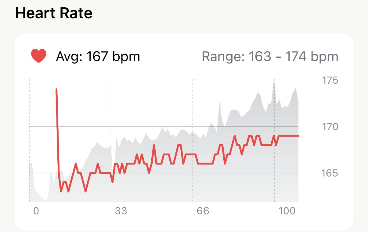
- Tap anywhere on the chart to read that moment: the exact BPM and how far into the run it was. Drag sideways to follow the climb, the surge, the recovery. A tap on the card outside the chart puts the marker away.
- Where the line breaks, there’s a gap. The same minutes that make up Missing Data in the zone bar are drawn as an empty stretch here rather than a line joined across it, so you can see where in the run the watch lost you — which is often the clue to why.
- The grey shape behind the line is the elevation profile, on runs with a route. A heart rate that rises exactly where the ground does is a hill, not a pace change.
- The axis along the bottom is time into the run, not distance. To find kilometre 8 rather than minute 42, the splits are the place to look.
The same two, on a single split#
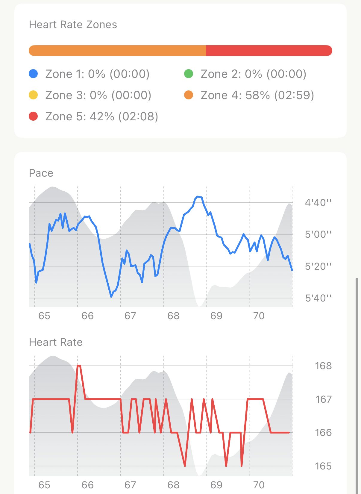
The run-wide sections answer “how hard was the run”. Tap any row in the splits and the same two answer it for that one kilometre: a zone bar for just those minutes, and the heart rate trace for just that stretch, with the pace chart above it so you can line the two up. It’s the place to check whether a slow split was a hill (heart rate up, pace down) or a breather (both down).
Worth knowing#
- Both sections are free, on every run and every split, however old. Nothing in either of them is Pro.
- The zones on a run and the run’s type are separate things. Changing your zones redraws every bar, but a run labelled Easy stays labelled Easy. Run types explains why, and how to relabel one yourself.
- Range is not Max HR. The high end of the range is the fastest your heart went on this run. Your Max HR, the number your zones are built from, lives in Settings and only changes when you change it.
The metric behind it: Why your heart rate zones don't add up
Get the app
See how hard every run really was.
Heart rate zones and the full trace, on every run you've ever recorded with a watch. Both free, and both use whatever zones you've set — change the zones and every run updates.
↓ Download Apex Run