
Make Apex Run count the way you do
Most of these you set once and never think about again. One of them changes what the word 'week' means everywhere in the app, and it's worth knowing which.
Four of these are housekeeping. One of them decides what “this week” means, which is why it’s first.
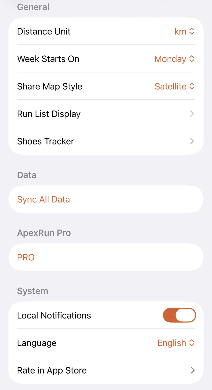
Week Starts On is the one that matters#
Monday or Sunday — that’s the whole choice, and it’s the reason two runners with identical training can quote different weekly mileage on a Saturday night.
Changing it moves the boundary everywhere the app says week: your weekly distance, duration and elevation on the Summary tab, the day-by-day bar chart beside them, the weekly widget on your Home Screen, and which column each run lands in on the activity heatmaps under Stats.
Pick whichever your training already uses. If your long run is Sunday, a Monday start keeps it inside the week it belongs to instead of opening the next one with your biggest session.
Kilometres or miles changes the splits, not just the labels#
Distance Unit is not a display conversion. Switch it to mi and Apex Run re-cuts every run into mile splits — real 1609 m segments with their own pace and heart rate — rather than showing kilometre splits with a converted number on them.
Pace follows — min/mi instead of min/km — and so does the splits chart on every run you’ve ever done, retroactively. Nothing is lost by switching back and forth; it’s just worth knowing the change goes deeper than the label.
Best efforts are the exception, and don’t move: that list is a fixed set of both — 1 km, 1 mile, 2 miles, 5 km, 10 km, 10 miles, half and full marathon — so a mile PB is there whichever unit you read the rest of the app in.
Run List Display: you’re choosing two, not three#
The header says three. One of them is already spoken for.
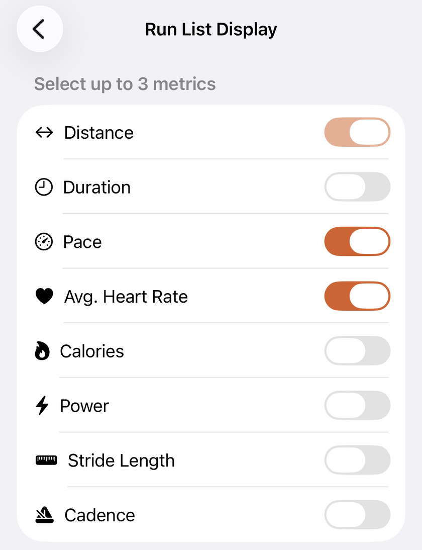
Distance is permanent, so the real decision is the two slots beside it, from seven: Duration, Pace, Avg. Heart Rate, Calories, Power, Stride Length and Cadence.
Both places a run shows up read this pair: the rows in list view and the cards in grid view. Switching between those two changes how much room the numbers get, never which numbers you get.
Once three are on, the rest go grey rather than swapping — turn one off first, then turn on the one you wanted. It takes a second to notice the first time, and it’s the only awkward corner on this screen.
What makes this worth revisiting rather than setting once: the useful pair changes with what you’re training. Deep in a base block where the whole point is ignoring pace, having pace on every card is just something to argue with — distance, duration and heart rate is the honest view. Chasing a 5K, swap heart rate for pace. Trying power, put watts where pace was.
The rest of the screen#
- Share Map Style — Standard or Satellite, and it applies to the map on every share card. Satellite reads better for trails and coastline; standard is clearer in a city, where the street grid is the recognisable part.
- Language — English, 简体中文 or 繁體中文. Changing it raises an alert asking you to restart the app, and it means it: some text won’t switch over until you do.
- Local Notifications — the toggle for the banner that tells you a new run has arrived. It’s on by default, and nothing else uses it.
- Shoes Tracker — lives in this section but isn’t a setting; it’s the mileage log for each pair of shoes.
Why it was built this way: Your run list, your metrics
Get the app
Ten seconds now, every screen right afterwards.
Units, week start, language and your run list are all free, all on one screen, and all reach every number in the app. Worth doing before you read anything else.
↓ Download Apex Run