
Colour your route by heart rate, pace or elevation
The map at the top of a run tells you where you went. The full-screen one tells you where it got hard — the red stretch of the route is the hill, or the surge, or the last two kilometres, and you can drag a finger along the chart to find out which.
A route is a line on a map until you know what happened along it. The full-screen map paints the run’s own data onto the line, so the climb, the surge and the fade are visible as colour before you read a single number. Then the chart under it lets you point at any moment and see where on the route it was.
Where to find it#
Tap the map at the top of any run. It fills the screen, with the route drawn between a green Start pin and a red End pin, and a pin at every kilometre or mile. ✕ in the corner takes you back.
Only runs with a route have it. A treadmill run has no map at the top and nothing to open; a watch run whose map should be there and isn’t is a case for Reimport.
The buttons down the right#
Five round buttons sit down the right-hand edge, top to bottom:
- Map style cycles through standard, hybrid and satellite. Satellite shows a trail or a coastline for what it is; standard is clearer in a city, where the street grid is the recognisable part. It goes back to standard the next time you open a map.
- Pins shows or hides the distance markers along the route.
- Hand shows or hides the best effort pills along the bottom. Tap a pill and that stretch lights up in yellow with the rest of the route greyed out.
- Chart opens the panel underneath and colours the route — the rest of this page.
- Play replays the run along the route, step by step, in 2D or 3D. It’s the one Pro feature on the screen.
Colour the route#
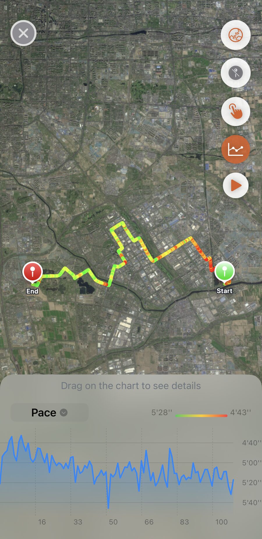
Tap the chart button and a panel slides up with a chart of the run, and the route takes on the chart’s colours. The dropdown on the panel picks the metric:
- Elevation — the default. Green is the lowest ground on the run, red the highest.
- Pace — green is slow, red is fast.
- Heart Rate — green is low, red is high. It’s only offered on runs that recorded a heart rate.
Whichever you pick, red means more — higher, faster, harder — so the reading is the same across all three.
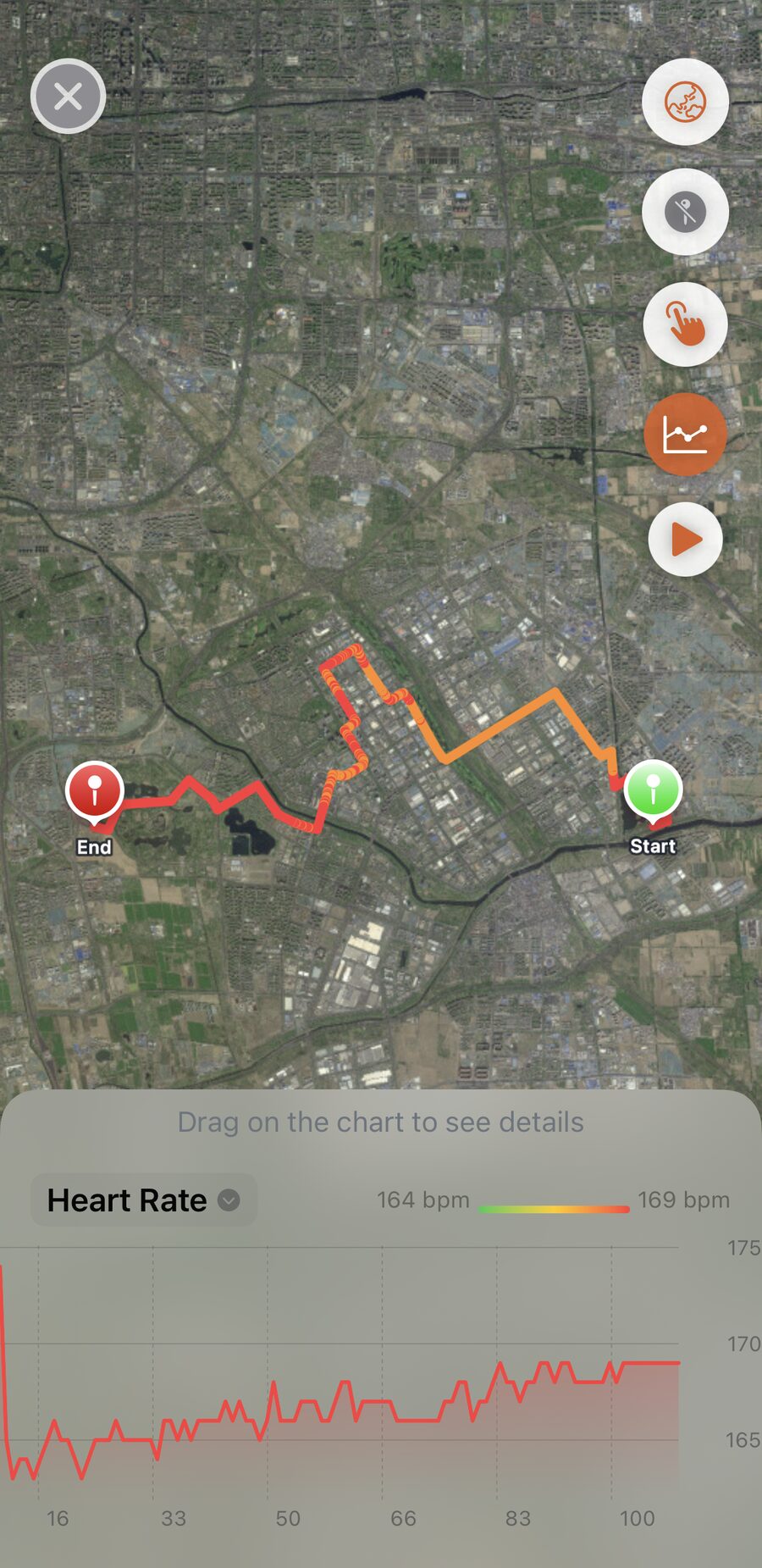
The legend beside the dropdown gives the two ends of the scale, and they’re this run’s own range, not fixed values. So the colours are relative: red on an easy run is the hardest part of an easy run, not a hard effort. For pace and heart rate the ends are the run’s typical low and high with the extremes trimmed off, which stops one spike at a road crossing owning the whole scale. Compare the shape of the colour along the route, not the colour of one run against another.
Drag the chart to find the spot#
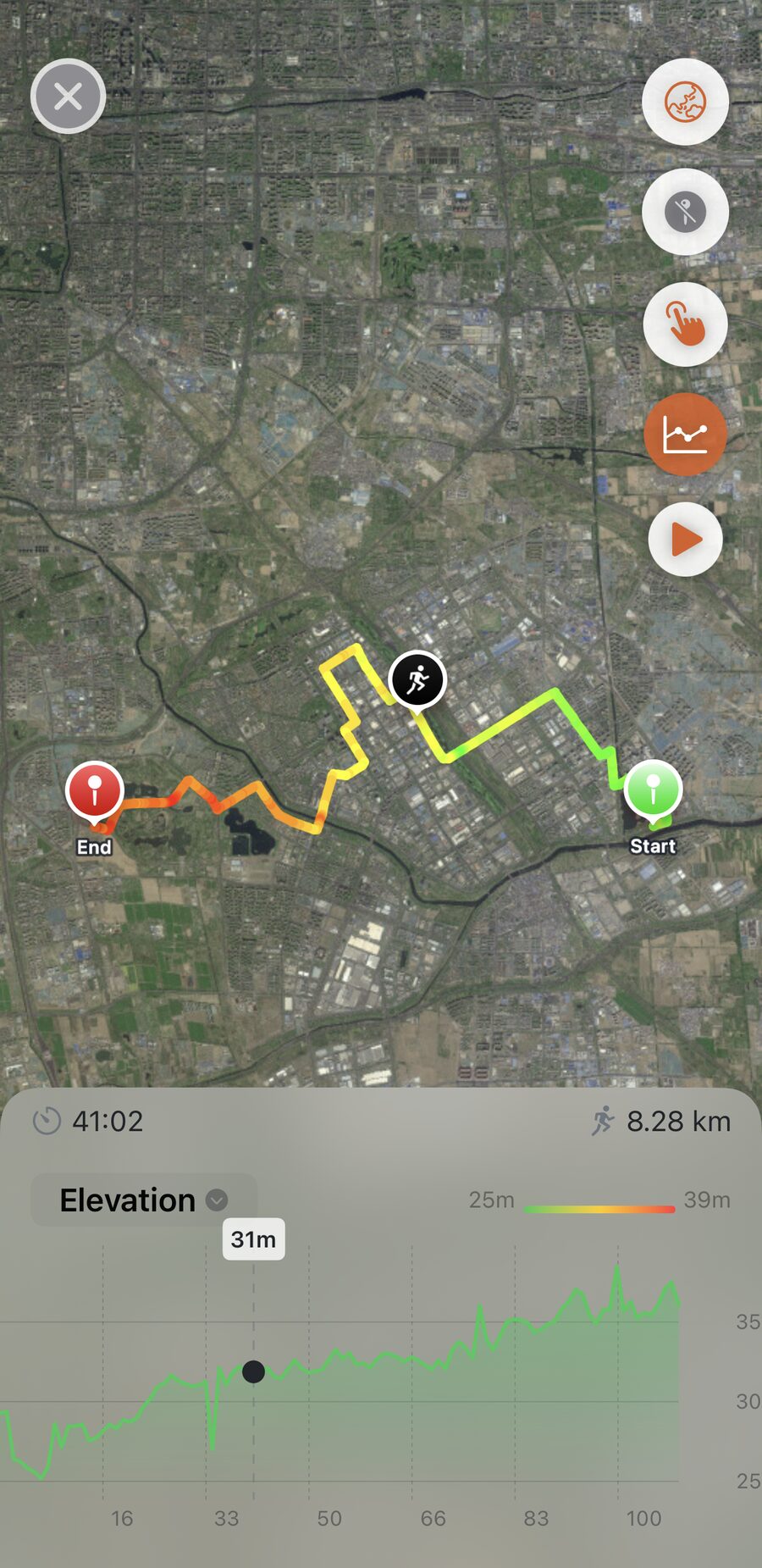
The panel says Drag on the chart to see details until you do. Drag along it and a runner marker slides along the route to the matching spot, with the time into the run and the distance covered above the chart, and the value at that moment on the chart itself. It’s the answer to “where was I when the pace fell off” without any arithmetic. Switch the dropdown and the same drag reads elevation or heart rate instead.
The pins work the other way round. Tap a distance pin on the route and the marker jumps to it, with the chart open at that moment. Tap the pin for kilometre 15 and you’re looking at kilometre 15.
Worth knowing#
- All of it is free except the play button. Colouring, the chart, the drag, all three map styles, on every run with a route.
- The colours are the run’s own scale. Two runs coloured by heart rate are not comparable by eye — read each one against its own legend.
- A dashed stretch of route is time the watch was paused. Nothing was recorded there, so it’s drawn as a gap rather than a line.
- Map style here is separate from the share cards. Settings → Share Map Style picks the map on the cards you share; this screen’s button changes only this screen, and only until you close it.
Get the app
See exactly where the run got hard.
Every run with a route gets the full-screen map — coloured by heart rate, pace or elevation, on standard, hybrid or satellite — for free. Only the replay is Pro.
↓ Download Apex Run