
A while ago a runner on r/runninglifestyle posted his training log. Not a chart, not a screenshot of an app. A screenshot of a spreadsheet: one row per run, date and distance and pace, grouped by week with the totals down the side. Plain cells, no colour, and I read the whole thing top to bottom.
I looked at it and thought two things at once. First, that I hadn’t kept a log like that in years. Second, that Apex Run already had every number in it. All those rows were sitting in the app, on hundreds of phones, being summarised into cards and trends and never once laid out as a list.
That’s the whole origin of the Training Log. No new data. The same runs, from a different angle.
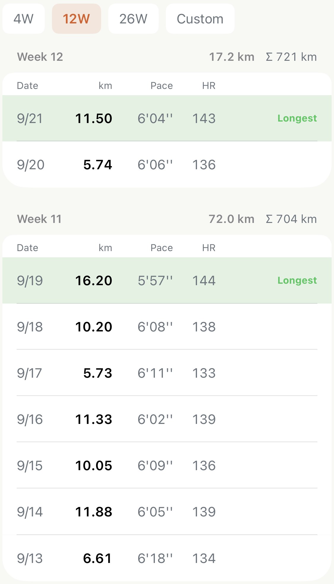
What a table does that a chart doesn’t#
The app already had weekly totals, monthly reports, trend lines. What none of them gave you was the sequence. A chart of weekly distance shows you that one week was bigger; a log shows you it was bigger because the long run and the tempo landed two days apart, and that the next week’s easy runs were slower than usual. The story is in the rows.
So the rule for the feature became: interpret nothing. Distance, pace, heart rate, per run, in order. Totals per week. A running cumulative. Everything else the app does is a reading of your data; this one is the data.
Blocks, not calendars#
The first version had the scopes every list has: this year, all time. They looked right and read wrong. Nobody trains by calendar year. You train in blocks, the twelve weeks before a race, the four weeks of a hard push, and a log is something you read block by block.
So the scopes became 4, 12 and 26 weeks, with Custom for anything else, and the week numbers count from the start of the block. Week 7 means week 7 of this build, which is the only week 7 a runner has ever cared about.
The one mark#
Tables are hard to read on a phone. Eight columns don’t fit, and a wall of numbers gives the eye nothing to hold. Two decisions came out of that. The table shows four columns and no more, and each week’s longest run is tinted and marked. That one mark turns a list into a shape: you can read a block by its long runs alone, the way a coach flicks through a log.
Giving the CSV back#
The thing that started this was a CSV, so the log exports one. Every run in the block, one row each, oldest first, with all the columns the phone can’t fit, plus a note field. The note is the part I care about most. “How did this run feel?” is the only thing the table can’t know, and it’s the line that makes a log yours rather than a printout.
The table is free. The export is Pro, which felt right: the log is something everyone should have, and the spreadsheet is the thing you take to a coach.
To the runner who posted that spreadsheet: thank you. You typed every row by hand, and you had no idea anyone would build a feature out of it. This one’s yours.