
Nutrition facts exist because someone decided that what goes into your food deserves a complete, standardized breakdown — not just the headline number.
Running data felt the same way to me. A share card with distance and pace is fine. But there’s so much more in a single run: calories, elevation, heart rate, cadence, stride, power, intensity. Most of it never makes it to the share.
The format that already worked#
The nutrition facts label is one of the most legible information displays ever designed. Dense but scannable. Every number has a label. The hierarchy is clear. It doesn’t feel cluttered because the format is familiar — you know how to read it before you even start.
So I borrowed it.
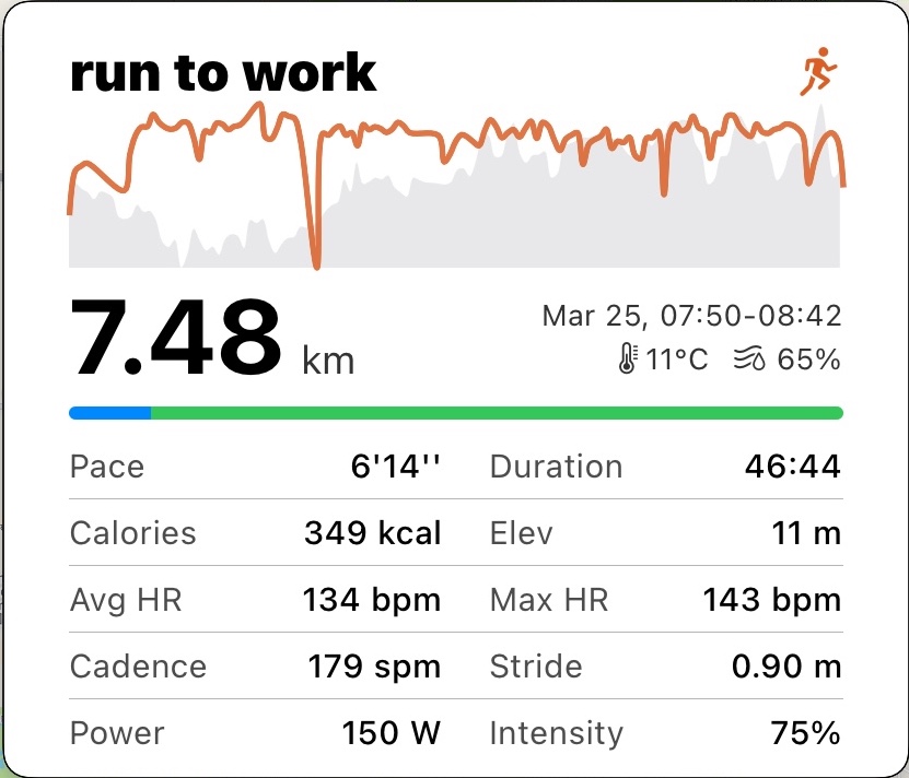
The Running Facts share template lays out your run metrics in the same table format: rows of labels and values, clean black lines on white, nothing omitted. Pace, duration, calories, elevation, average and max heart rate, cadence, stride, power, intensity — all of it in one card. A small heart rate chart sits at the top for the shape of the run; the rest is just the facts.
For the data runners#
Not everyone wants this much on a share. But for the runner who cares about cadence and power and wants to send something that shows the full picture — this is the template. Every number, nothing hidden.
Nutrition facts don’t summarize. They list. That’s the idea.