
A few days ago, my friend sent me a screenshot of his interval run share. Standard card — total distance, duration, average pace. He followed it up with a message: “this tells me nothing.”
He was right. He’d just done 7 × 1km repeats. The share card made it look like a slow jog.
The problem with a single number#
An interval run isn’t one thing. It’s a structure — alternating effort and recovery, repeated. The whole point is the pattern: how fast were the work intervals, how consistent were they, how much rest in between. A single average pace flattens all of that into noise.
For a 10km easy run, average pace is a fine summary. For intervals, it’s nearly useless.
What the template shows#
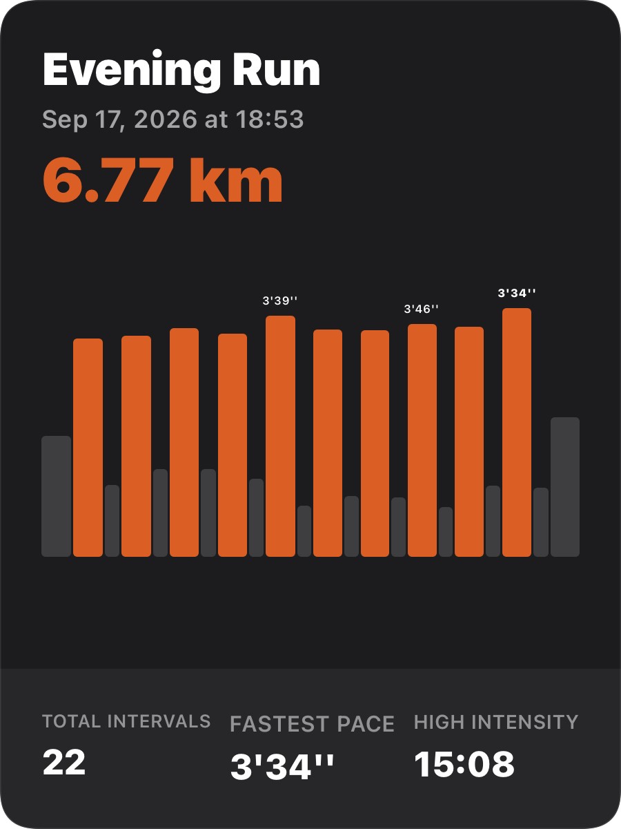
The interval share template centers on a bar chart. Orange bars are work intervals; gray bars are rest. Bar height encodes pace — taller means faster. A few key pace labels float above standout bars so you can read the numbers without it getting cluttered.
Below the chart, three stats: total intervals, fastest pace, and total time at high intensity. Together they give you the shape of the workout at a glance — how many reps, how fast at peak, how much hard effort in total.
For the friend who complained#
He does intervals every week. Now when he shares, you can see the alternating pattern, spot the rep where he pushed hardest, and tell immediately that this wasn’t a jog — it was a workout.
That’s all a share card needs to do.