
Some runners finish a workout, glance at average pace, and move on. That’s completely fine.
And then there are the others — the ones who want to know exactly what happened at kilometer 4, what their heart rate was doing in the back half, whether their cadence held up on the climb. For those runners, Apex Run has a split detail view that doesn’t hold back.
Everything, per split#
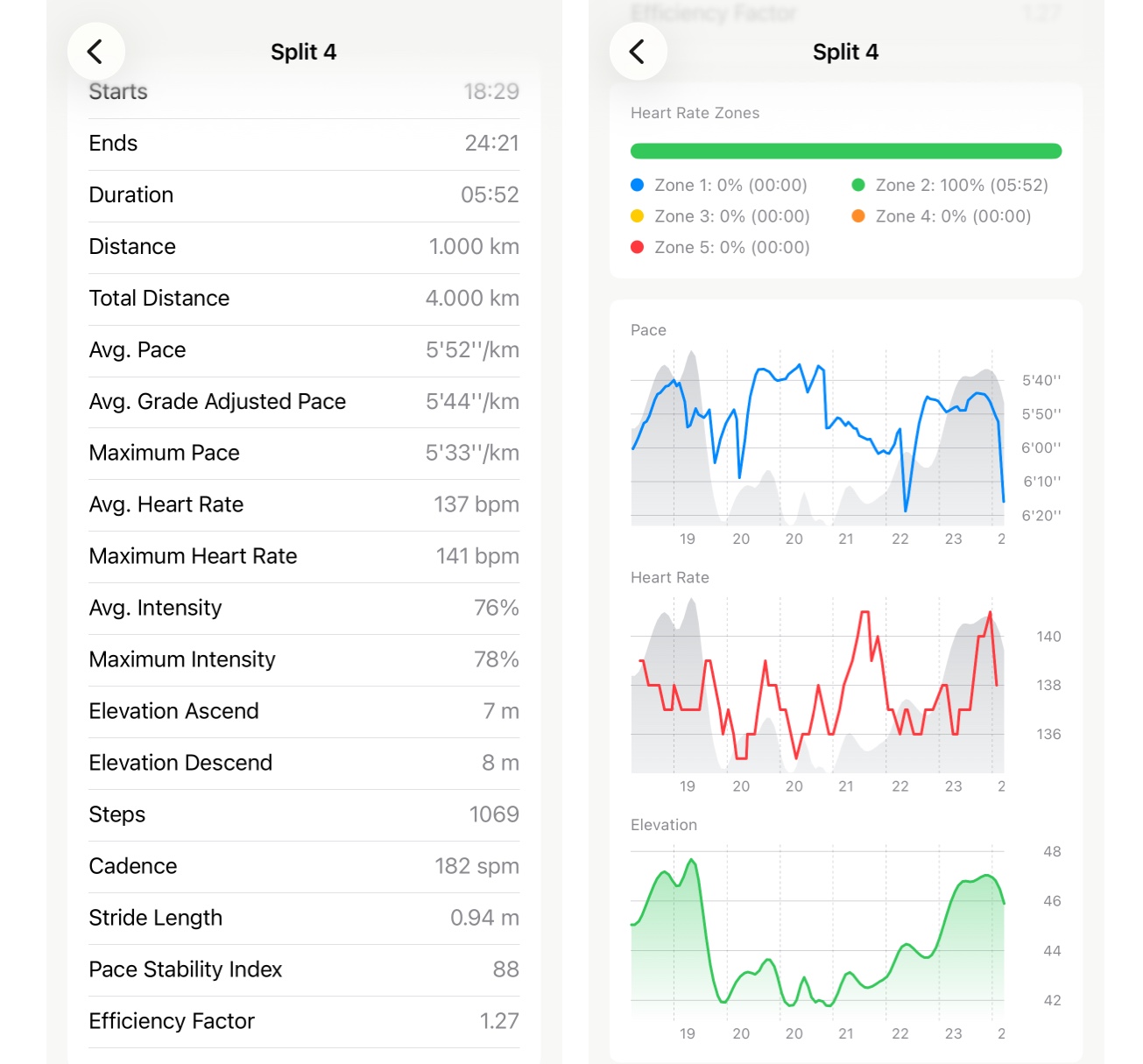
Tap any split in your run and you get a dedicated screen for that segment. The metrics section covers the full picture:
Timing & Distance — start time and end time (relative to your run start), duration, split distance, and cumulative distance to the end of that split.
Pace — average pace, grade-adjusted pace (GAP) if GPS data is available, and max pace within the split.
Heart Rate — average and max BPM, plus average and max intensity as a percentage of your max HR.
Form — step count, average cadence, and average stride length.
Elevation — total ascent and descent for that split.
For Pro users, two additional metrics appear: Pace Stability Index and Running Efficiency.
Everything is calculated from the raw sensor data within that split’s window — not interpolated from the whole run.
Heart rate zones and charts#
Below the metrics, a heart rate zones breakdown shows how your time in that split was distributed across zones — a segmented color bar with a per-zone legend showing percentage and duration.
For splits longer than one minute, three charts appear: pace over time (with elevation overlay), heart rate over time (with elevation overlay), and an elevation profile. Each one zoomed to just that split, so the detail actually shows.
Who it’s for#
Not everyone wants this much. For casual review, the standard split table is enough.
But if you’re the kind of runner who wonders why kilometer 7 felt different from kilometer 6 — and wants actual numbers to look at — this view exists for you.